

In December 2024, a paper estimated that air pollution from US data centers could impose more than $20 billion in annual public health burdens by 2030. A later version moved that forward to 2028.
The paper has other shocking estimates, perhaps most is that emergency backup diesel generators around Northern Virginia data centers alone create hundreds of millions of dollars in public health costs, with damages large enough to register as far away as Long Island.
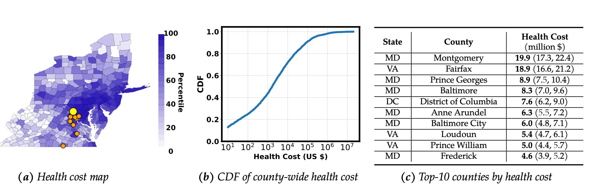
The shading on the map shows each county’s rank by modeled annual health cost from the Virginia generators. Each of Long Island’s counties are very dark, which the middle graph says corresponds to maybe $100,000 to $1 million in expected annual health damages each, so altogether Long Island’s 4 counties (I’m including NYC) may be losing as much as $4 million in public health harm. These diesel generators are modeled to create $220-$300 million in public health costs.
This seems crazy. Northern Virginia’s two biggest data center counties generate about $1.2 billion in local tax revenue each year1, and the study implies at least a fifth of that is cancelled out by the harm of their backup power alone, with most of the damage falling on people far from where the sources are built and regulated. It’s as if Northern Virginia were stealing $4 million a year from the health of Long Island. This seems wildly unjust, counter-intuitive, and a candidate for a data center problem that dwarfs the overblown concerns about water or land.
However, while local air pollution problems with data centers are very real, this specific paper is easy to misread and come away from thinking the national-level harm is much worse than it actually is. To see the difference, you first need a ton of grounding in the situation with air pollution in the US.
Going into this, based on what I understood about air pollution, I was under the impression that this was a serious problem with data centers at the national level. However, I’ve come away thinking that while data centers can definitely create serious local problems for air pollution and need to be carefully and transparently governed (and there are clear places where that’s already failed), I no longer believe that on net they will stand out as a significant national problem for air pollution in the near future.
Air pollution is complicated, but not too complicated. You need a lot of individually simple facts that together paint a complex picture before understanding how data centers fit into it. This first post on air pollution will go over these facts. I think that I’ve been able to finally get my footing, and this post is basically all my notes on what I think is most important to understand to get your footing as well. This is far and away the longest of the four, but I think also very fun and interesting once you get beyond the necessary technical details at the beginning.
The ethics of air pollution are wild. Air pollution is both complex and urgent enough that it forces us to break through simple vapid generalities and actually wrestle with how the core values we’re all running on to keep society together conflict with each other, and to think in a much more meta way about how to trade those values off. Even if you don’t care about data centers at all, I think the ethics of air pollution is on its own such an interesting intersection of so many different questions that it can be a blast to read about. Part 2 will focus on this.
Part 3 is on why I don’t expect data centers to become a significant national air quality problem in America. I also unpack the paper above and contextualize its predictions against other industries.
Part 4 covers data centers at the local level, and where they have and can turn into significant problems for air pollution, especially when they take advantage of lax permitting rules. The most obvious case is xAI’s Colossus in South Memphis, where xAI used dozens of gas turbines near already heavily polluted residential areas. I’ll cover that in detail in Part 4.
One important note here is that I’m excluding the climate effects of air pollution. Effects on climate are so different from other harms of air pollution that they deserve a separate post. All death and DALY figures I use for air pollution harms are taken from the IHME’s Global Burden of Disease project.
Contents
The three main ways long-term exposure to air pollution harms us
American air is way cleaner than it was decades ago, and way cleaner than the world’s average
A lot of US pollution harms occur in either average US air quality, or California
How air pollution compares in deaths and DALYs to other problems
When does an air pollution source have a very local impact vs a very broad impact?
Comparisons between different pollution sources are often counter-intuitive
The main sources of outdoor air pollution in the US, and their decline
Inequity in exposure to air pollution, and failures of governance
The three main ways long-term exposure to air pollution harms us
There are many forms of air pollution, but the main way it currently harms us is via one of three pathways: PM2.5 (fine particles), ozone (a gas), and direct carcinogens. Their types and levels of harm are very different. As of writing, no safe threshold of air pollution has been identified, it appears to be harmful at all concentrations we encounter, and the more we’re exposed the more harm happens, both in terms of concentration and time. There’s no threshold where air pollution starts being harmful, it always is, just different levels of harm.2 The vast majority of ways air pollution harms us is due to long-term exposure, mostly via the buildup of risk that we develop specific diseases.
PM2.5
PM2.5 is fine particulate matter, particles 2.5 micrometers or smaller. It causes the large majority of the harms of air pollution. Roughly 70,000 of the 83,000 annual American deaths caused by outdoor air pollution are due to PM2.5.3 It can either come out directly from a pollution source (this is “primary PM2.5”) or be created when other types of air pollution interact with the atmosphere (“secondary PM2.5”).
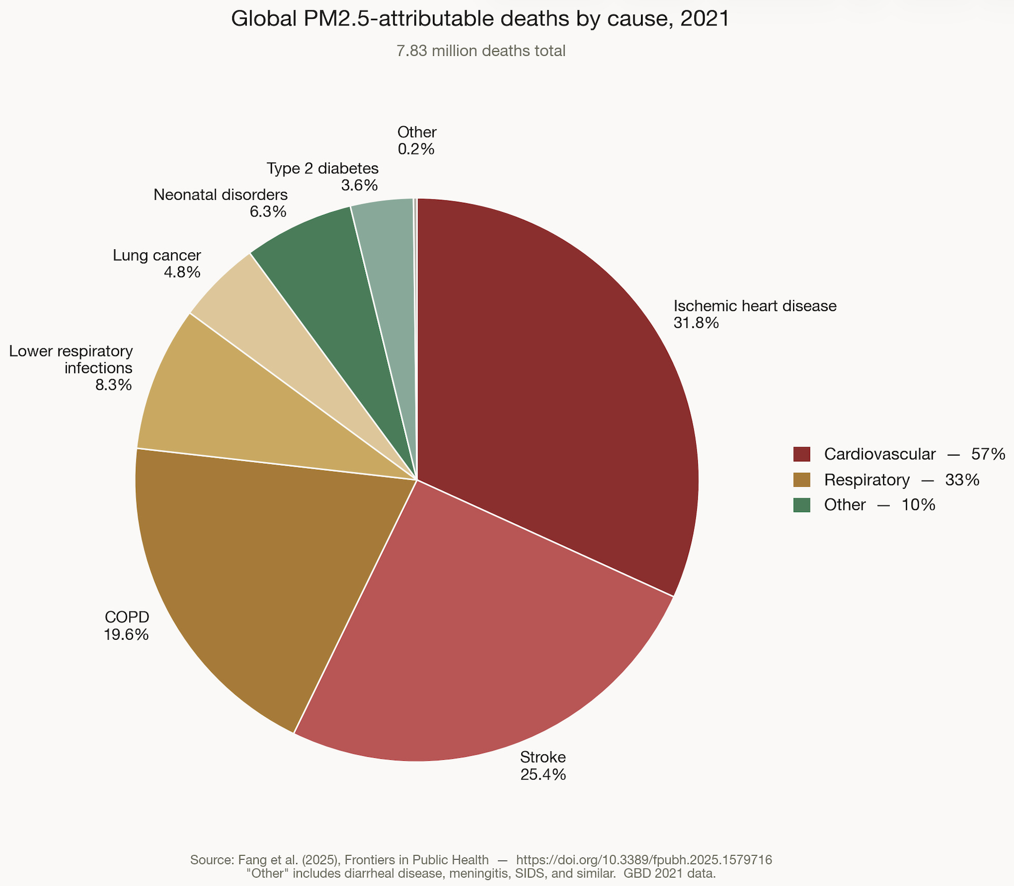
Half of all premature deaths from PM2.5 are cardiovascular rather than respiratory. You’d expect something that harms you when you inhale it to mainly be bad for your lungs, but one of the reasons PM2.5 particles are so dangerous is that some of them are small enough to slip through your lungs’ membrane into the bloodstream, and get distributed everywhere blood flows. PM2.5 is associated with many different causes of death, here’s the 2021 global breakdown:
Something really weird about PM2.5 is that the long-term harm of additional units of it decrease the more there already is in the air. Here’s a rough chart of how these harms compare:
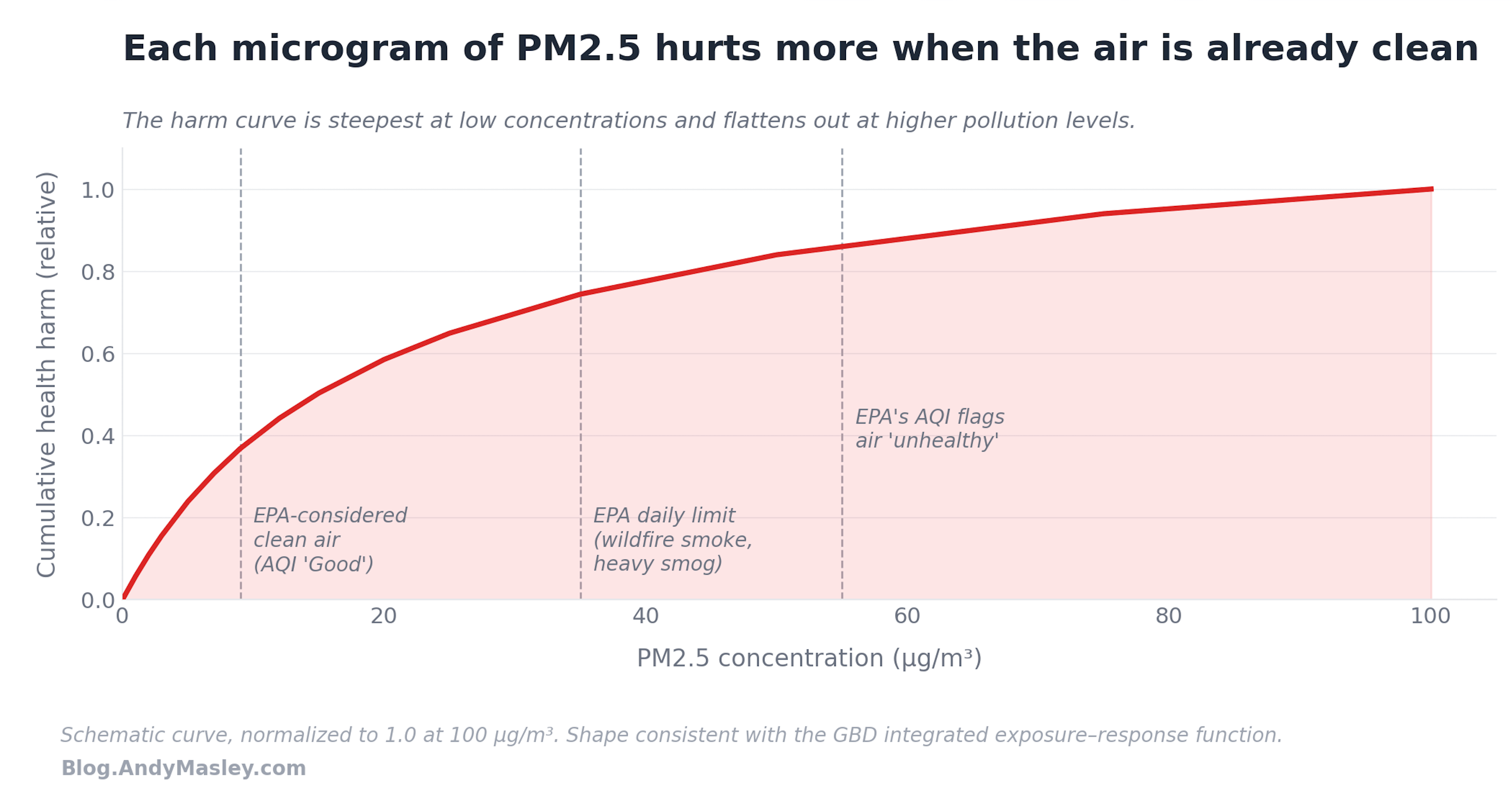
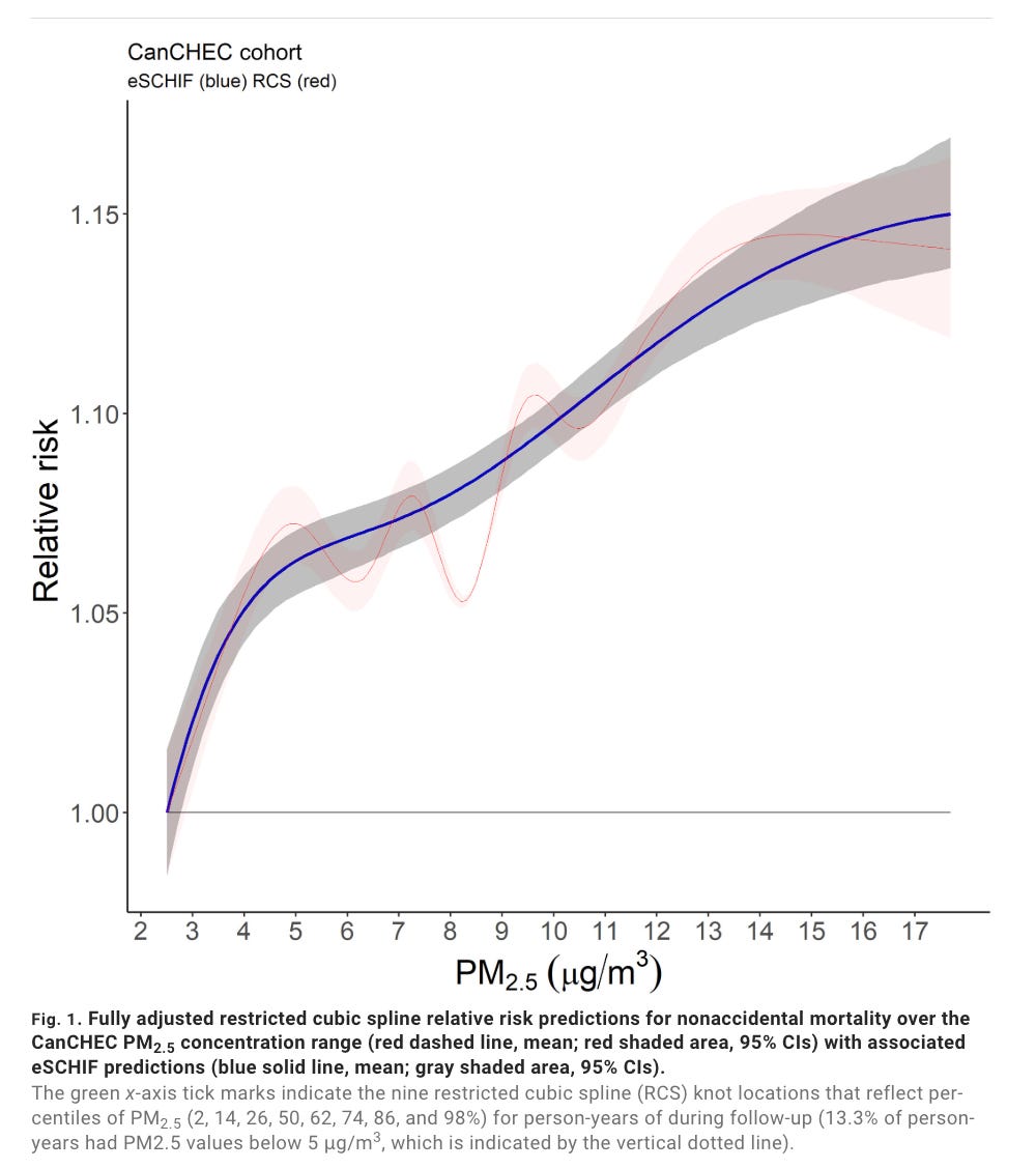
This is a simplified approximation, more serious estimates say the curve may look more like this:
This means that if we graph how much additional harm is created by each additional unit of PM2.5, we get a graph that looks like this:
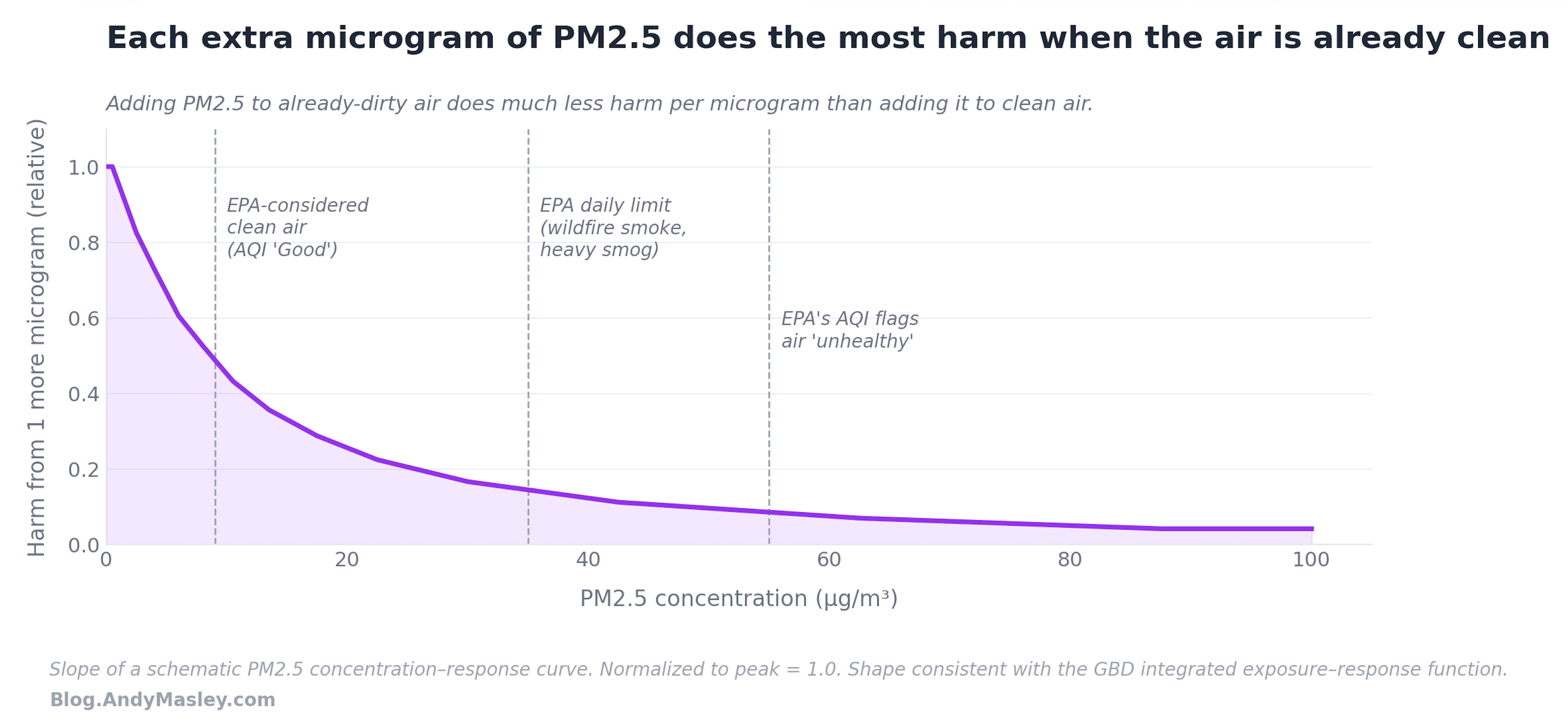
When you get to the concentration at the EPA’s daily limit, a decent amount of the potential harm is already being done.
We don’t actually know if this pattern holds for all the ways PM2.5 harms us. For example, very high indoor exposure to PM2.5 in pregnant women is associated with lower birthweight, and the trend there appears to be roughly linear.
The relationship between harm and time exposed is probably linear for long-term exposure, though short-term exposure has its own separate bad effects.
Some types of PM2.5 are more dangerous. One study found that PM2.5 created by sulfur dioxide from coal plants is about twice as harmful as average.
PM2.5 can last a long time in the air, sometimes as much as 4-7 days.4 This means it can be carried hundreds or even thousands of miles downwind before harming someone. PM2.5 from a wood fireplace in Vermont can end up being breathed by someone in Boston.
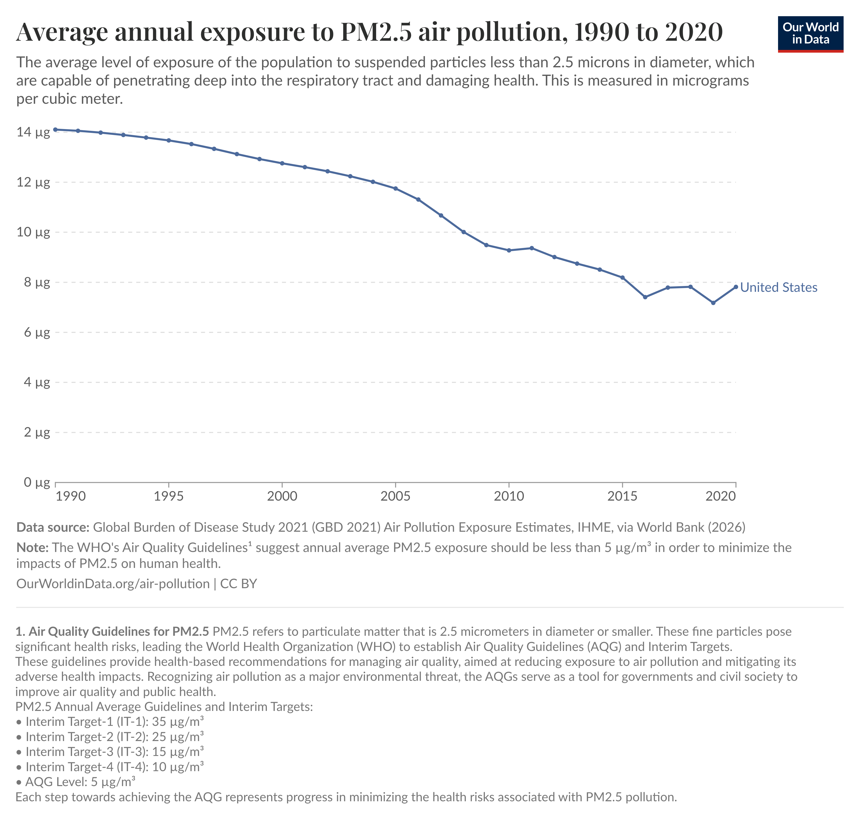
PM2.5 concentrations in US air have declined steadily since 1990, but recently stalled out due to among other things an increase in forest fires exacerbated by climate change.
Ozone
Ozone causes 13,000 American deaths a year.5 Unlike PM2.5, the vast majority of ozone’s long-term harm to our health is via just one pathway: COPD (Chronic Obstructive Pulmonary Disease), which is a progressive, irreversible lung disease that makes it difficult to breathe. Ozone seems to be responsible for about 10% of COPD deaths, smoking causes about 80%6. It can have other respiratory effects as well.
Ground-level ambient ozone generally isn’t emitted directly by ordinary outdoor pollution sources. It forms in the air when NOx (explained below) and volatile organic compounds react in sunlight.
Unlike PM2.5, the harm of ozone seems to scale basically linearly with how much concentration there is in the air. Each additional unit adds about the same level of harm. Ozone concentration has had a more gradual drop than PM2.5, but as explained below, this is in part due to more ozone being outside of our control.

Direct carcinogens
Some forms of air pollution are carcinogens that increase your risk of cancer when you inhale them. These cause a much smaller part of total US deaths from air pollution, because there’s so little in the air, each unit adds only a tiny amount of cancer risk, and cancer is both rarer and slower to develop than cardiovascular disease.
Direct carcinogens also aren’t emitted in especially large quantities by the power generation sources data centers draw from. The study that found that data centers could cause $20 billion in health damages doesn’t even consider them as an avenue of harm, though they are a risk when onsite gas turbines are built close to homes, which will be the main source of carcinogen exposure that I'll focus on in Part 4.
How does the harm of PM2.5 compare to ozone?
Per unit, PM2.5 is far and away the worst. A 10 microgram per cubic meter (µg/m³) increase in long-term PM2.5 exposure raises all-cause mortality by about 5-8% while the same increase in long-term ozone raises mortality by something more like 0.5-1%. So PM2.5 is roughly an order of magnitude more harmful per microgram than ozone, though this comparison is super fuzzy because the two are very different in how they’re delivered and how many people are exposed to them.
Here are the rough numbers on how each type of air pollution harm compares. HAP here is Hazardous Air Pollutants, another name for direct carcinogens:
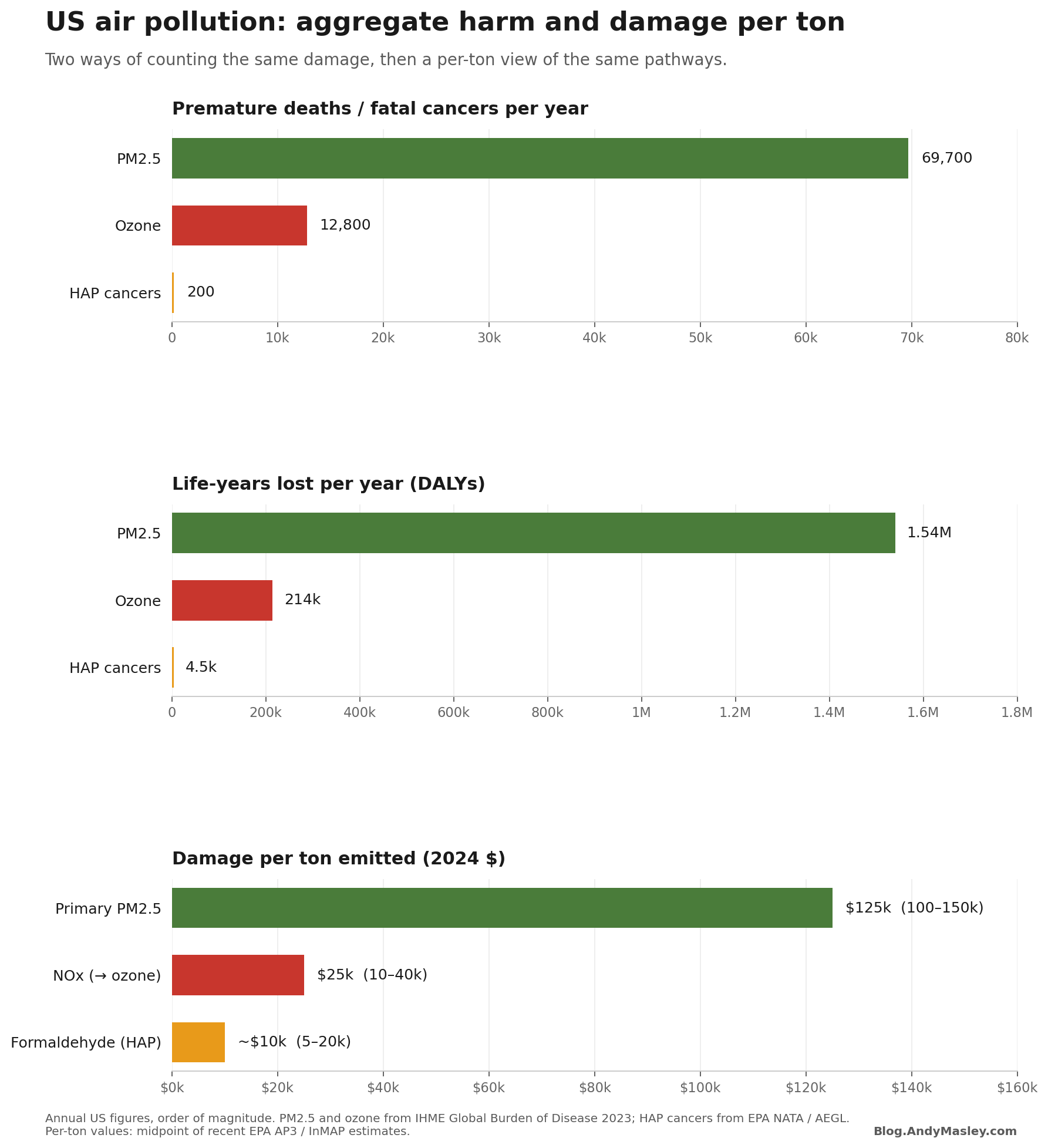
This graph can give you some idea of how harmful each is, but there’s no single final answer because the harm depends a lot on the specifics of where emissions happen.
Long-term exposure is where the vast majority of air pollution harm comes from
The large majority of the modeled health costs of air pollution come from lost years of life from longterm exposure.7 Most of the diseases that air pollution causes develop over years or decades. Things like heart disease or stroke or lung cancer or COPD. Ozone damage to lung tissue also accumulates over long periods of time. Acute spikes in air pollution can trigger heart attacks or asthma attacks in people who are already vulnerable to either, but they are a small fraction of the total health costs of air pollution.
A long-term 10 μg/m³ increase in PM2.5 raises annual all-cause mortality by about 5-8%.8 A one week 10 μg/m³ spike raises mortality that week by something like 0.2 to 1%, and then the effect fades.9
When looking at sources of pollution like data centers, the main question for total health cost is how much they increase long-term annual averages of air pollution. Short-term spikes do matter a lot too, and have their own bad short-term health effects, but a big part of their harm to us comes from the increases in total average ambient air pollution they add to our net exposure.
Particles that make PM2.5 and ozone
NOx
NOx (pronounced as a word rather than spelled out, when reading it aloud say “knocks”) is the name of the group of two molecules: nitric oxide (NO) and nitrogen dioxide (NO₂).
A lot of NOx’s long-term harm comes from the fact that when it enters the atmosphere, it can react to other chemicals and create ozone or PM2.5. NO₂ can also cause short-term harm, and this shows up where data centers have built onsite generation too close to people’s homes, but its total health harm mostly comes from the ozone and PM2.5 it can create.
NOx creates way more ozone than PM2.5, it produces way more by mass, but since PM2.5 is roughly 10x more harmful, it can still make up a significant part of NOx’s total harm to people.10
There are six key things to know about NOx.
First, the types of dangerous pollution it creates depends on the air conditions it’s released into. To turn into ozone, it needs sunlight and volatile organic compounds (VOCs), so ozone from NOx is highest in the summer and mostly doesn’t get produced on cold cloudy days. PM2.5 formation needs ammonia (mostly from agriculture) and happens more in cold humid conditions. Trees are a huge source of VOCs, so rural areas tend to have lots of VOCs but not much NOx, and cities have lots of NOx and not much VOCs, and when excess city NOx blows downwind into rural areas, a lot of ozone can be created. A lot of the harm of NOx emitted in cities happens nearby in more rural areas.
Something weird here is that NOx itself also reacts with ozone and turns it into oxygen. So releasing a little NOx can create ozone, but if an area releases enough the NOx can start to cancel out the ozone the previous NOx created. In a city with a lot of NOx already, adding more NOx can actually reduce local ozone, but this also leads to more total NOx in the air, which can spread downwind and cause more ozone miles away where there wasn’t much NOx before. So there are situations where applying pollution controls in already polluted areas actually increases local ozone but decreases total regional ozone.
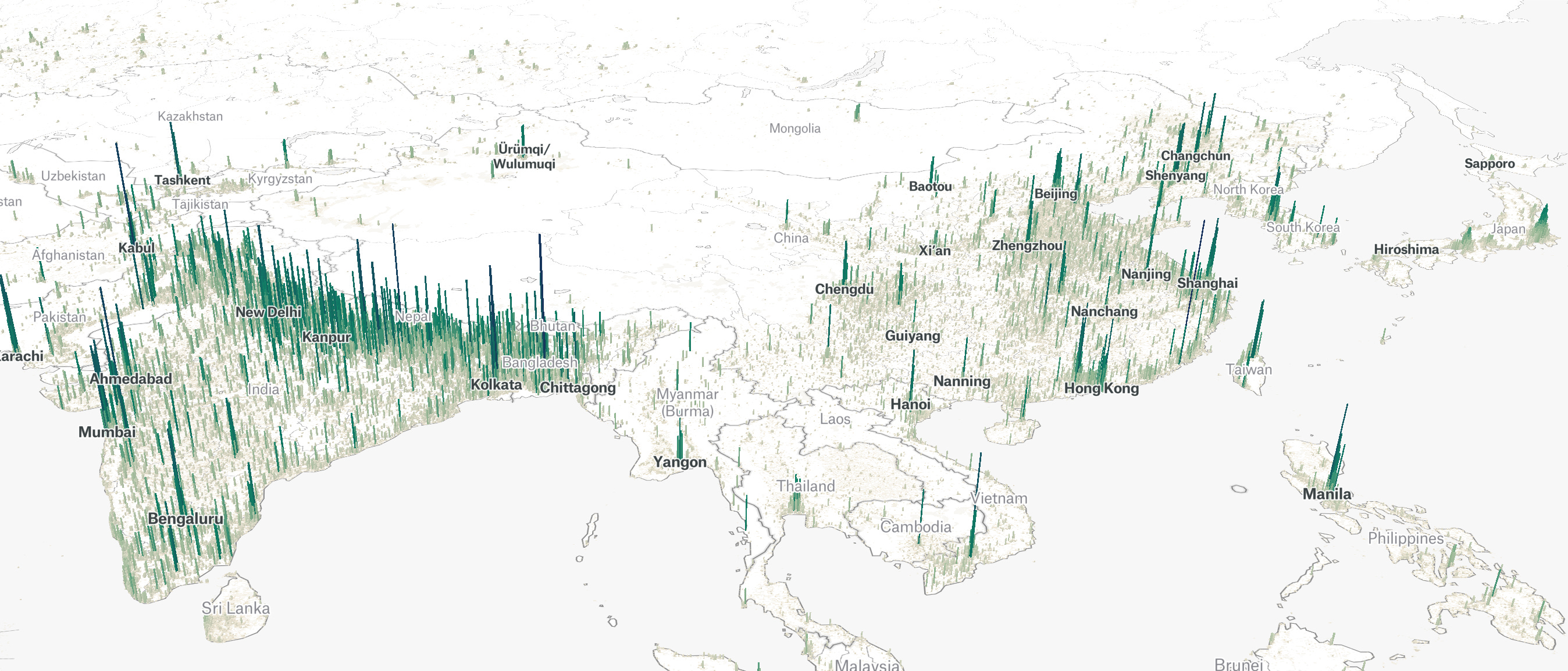
Second, NOx can travel far before having the reactions that turn it into dangerous pollution. It last about a day in the air, which is long enough to be carried for tens to sometimes hundreds of miles by wind before being converted to something else.11 The secondary PM2.5 it can create lasts even longer, so PM2.5 effects from NOx can show up hundreds of miles away from the source. This is how you get harm from data centers in Virginia showing up on Long Island.
Third, how physically high up NOx is emitted matters a lot. Emissions close to the ground concentrate NOx locally, because it’s more difficult for it to blow away. Tall stacks at power plants let it more easily disperse far away as it’s carried away by wind.
Fourth, different sources of air pollution emit different amounts of NOx. For data centers, we really only care about power generation. We’ll get into the specifics more in Part 4.
Fifth, NO₂ itself has specific short-term health harms, among other things asthma. There’s some evidence that consistent exposure to NO₂ also causes long-term harm, but it’s too uncertain to say either way because it’s often so bundled with other harmful pollutants.
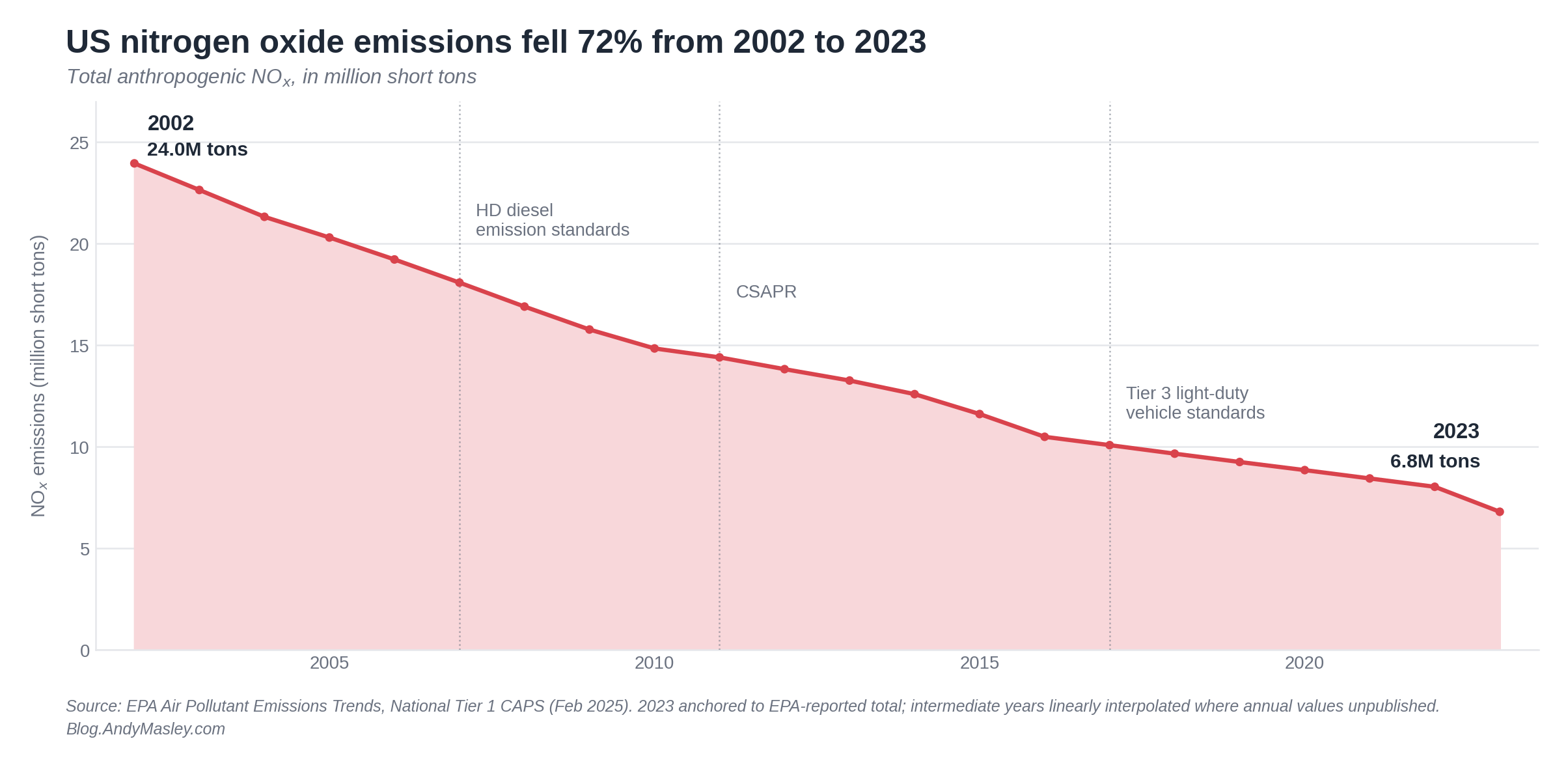
Sixth, US NOx emissions have declined a moderate amount over the last two decades.
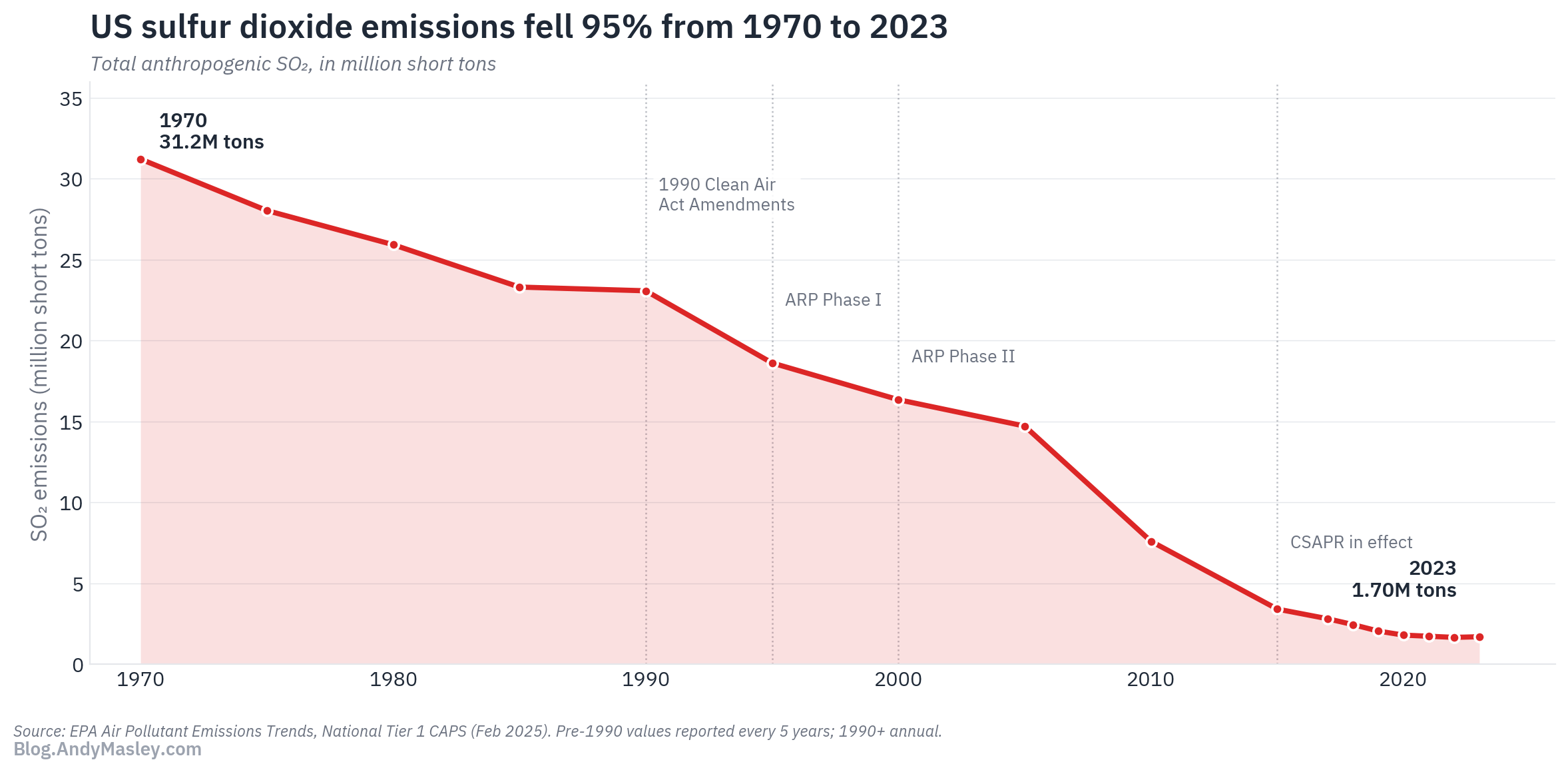
SO2
SO2 (sulfur dioxide) is the other thing that makes secondary PM2.5 relevant to data centers. Like NOx, its main long-term harm comes from what it makes in the atmosphere rather than direct effects of breathing it. It can also irritate airways and trigger asthma symptoms, similar to NO₂, but these are dwarfed by the harms of the PM2.5 it creates.
The vast majority of SO2 produced by data center power draw comes from coal power plants specifically. Coal is the only major US electrical power source that emits significant levels of sulfur.12
Backup diesel generators can also create SO2. These rarely run, but will still be an important part of the story with data centers.
Like NOx, SO2 lasts for a day or two in the air, meaning it can be carried hundreds of miles downwind and cross state lines, and the PM2.5 it creates can itself be carried much farther, and harm people far away from the coal plant.
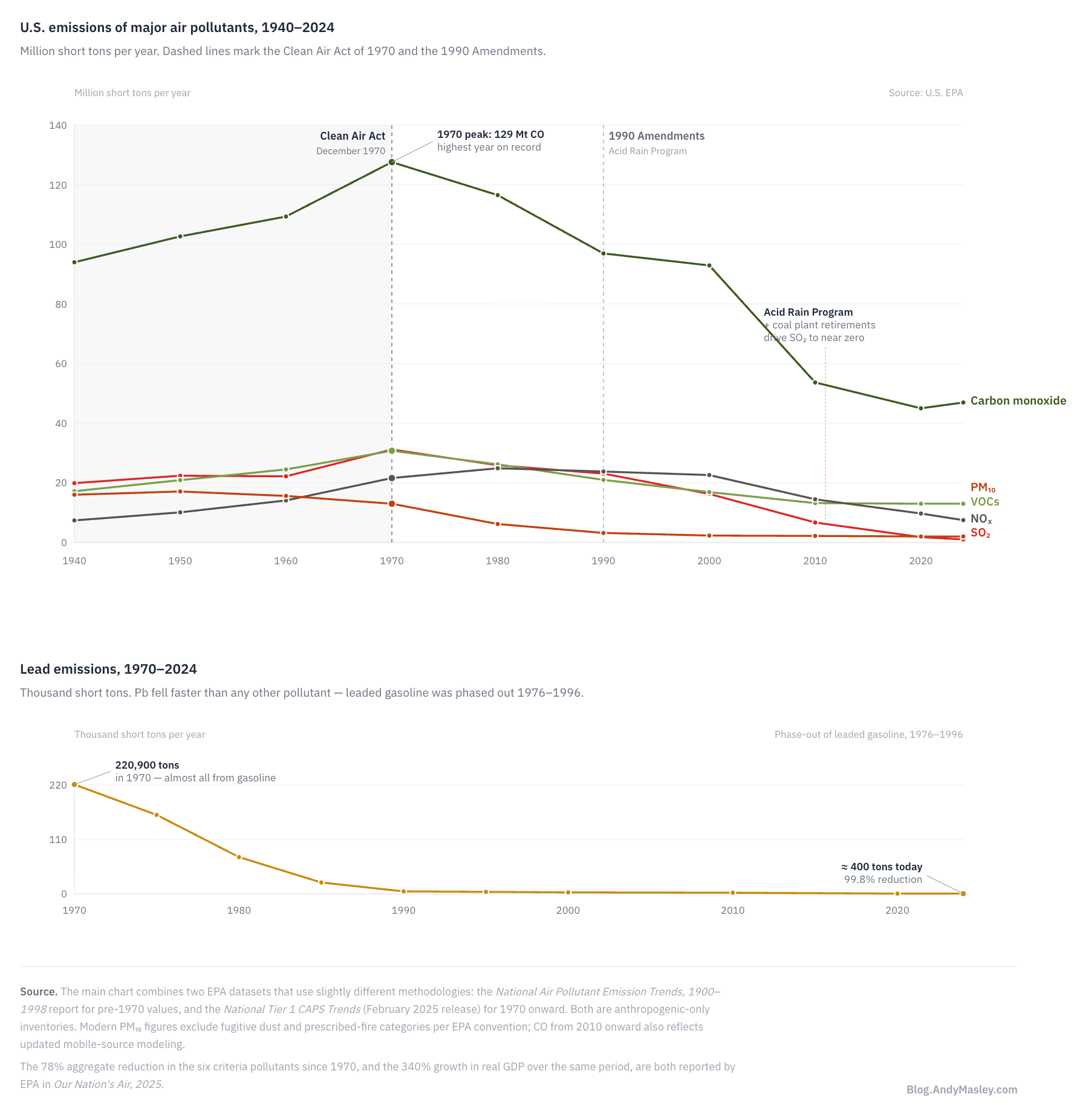
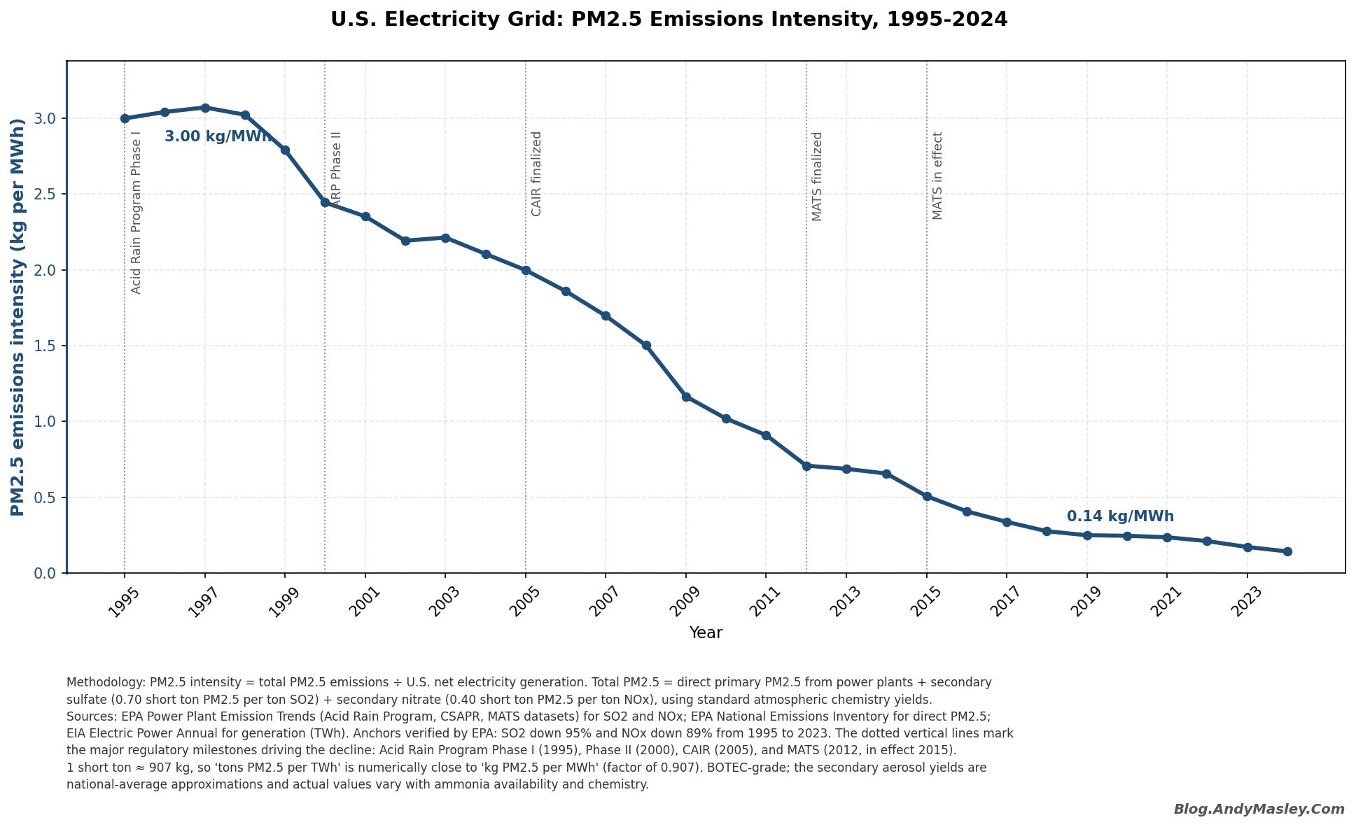
US SO2 emissions have collapsed since 1990, driven by the Clean Air Act Acid Rain Program’s cap-and-trade system, scrubber installations, and coal plant retirements. Total US SO2 is down roughly 95% from its peak.13 SO2 reduction is a part of why US air pollution mortality has dramatically fallen, yet it’s so harmful that it’s still a key part of the story of how data centers can harm us via air pollution.
Harms from short-term exposure
PM2.5, ozone, and NO₂ can each trigger asthma attacks (especially in kids), reduce lung function and exercise tolerance, irritate the eyes/throat/nose, and increase ER visits for respiratory problems.
In the US, roughly 25 million people have asthma (about 8% of the population), driving around 1 million asthma ED visits and ~95,000 hospitalizations a year at a total economic cost near $80 billion annually. It might cause one in six new childhood cases of asthma.14
PM2.5 spikes can also trigger heart attacks and strokes in people with existing heart disease, and are linked to worse cognitive performance. Daily PM2.5 spikes are followed within a few days by small bumps in mortality.15 Ozone’s short-term effects are mostly respiratory.
NO₂ (one of the two types of NOx) is a short-term direct lung irritant, and can cause inflammation that makes people more vulnerable to respiratory infections. Significant increases in NO₂, which can come from nearby onsite gas turbines data centers use, are associated with increases in more children having asthma attacks that send them to the ER. One study estimated that traffic-related NO₂ was responsible for about 134,000 new pediatric asthma cases per year in the US, about 17.6% of all childhood asthma incidence.
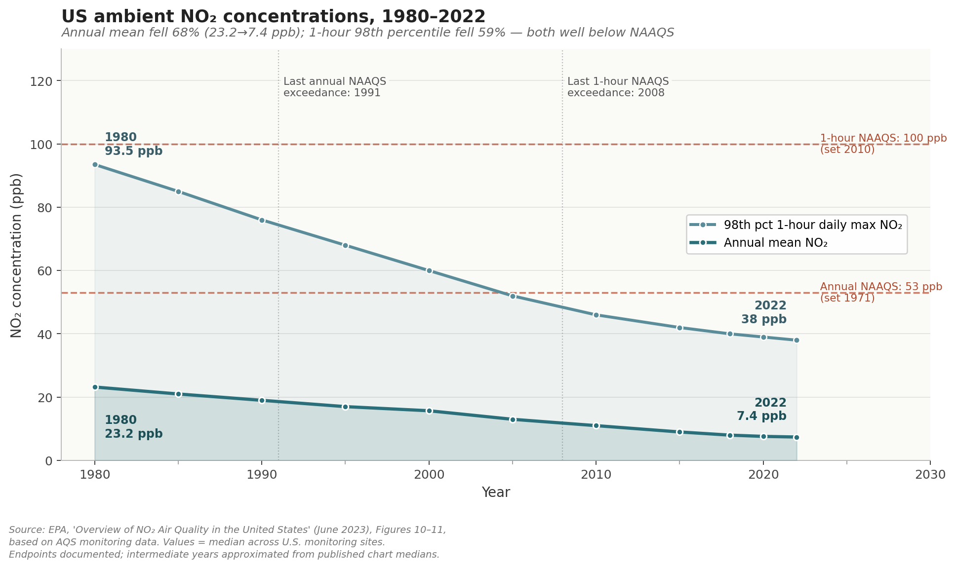
NO₂ either reacts with the atmosphere or disperses quickly, so concentrations drop off within a few hundred meters of where it’s emitted, usually under a mile.16 Only people very close to the source (like a gas turbine or a highway) experience the short-term spikes.
There has been a big general reduction in absolute ambient NO₂ concentrations in US air, though large relative disparities remain. Both the annual mean exposure to NO₂ and the 98th percentile 1-hour daily max NO₂ exposure are well below the corresponding EPA National Air Quality Standards (NAAQS) for them.17
Short-term exposure can significantly add to your cumulative long-term exposure
One last harm of short-term air pollution is when you get such a big hit of it that it increases your total average exposure for the year. Wood has so much PM2.5 that standing around a wood fire for an hour can raise your annual total PM2.5 exposure by 0.3%.18 One study found that people who didn’t smoke but used wood stoves for at least 30 days per year were twice as likely to get lung cancer as non-smokers who didn’t use the stoves. This was caused by their average exposure going up as a result of individual quick hits of way higher PM2.5.
Anthropogenic vs natural air pollution
There are natural and anthropogenic (human) sources of air pollution. Most analysis mainly focuses on anthropogenic air pollution, because that’s what policy can actually reduce.
About 15-20% of the PM2.5 the average American breathes comes from natural sources19, mainly dust, sea salt, and the fine particles that form when trees and other plants emit gases that react in the atmosphere. Something that’s on the border between natural and manmade, and the biggest single source of primary PM2.5 emissions in the US, is wildfire smoke.20
In general, burning wood just emits crazy, crazy amounts of PM2.5 compared to most other things. Whenever you can smell burning wood, whether it’s a Canadian wildfire a thousand miles away or a quaint New England wood stove, you should assume you’re getting a much higher dose of PM2.5 than almost anything else you encounter outdoors.
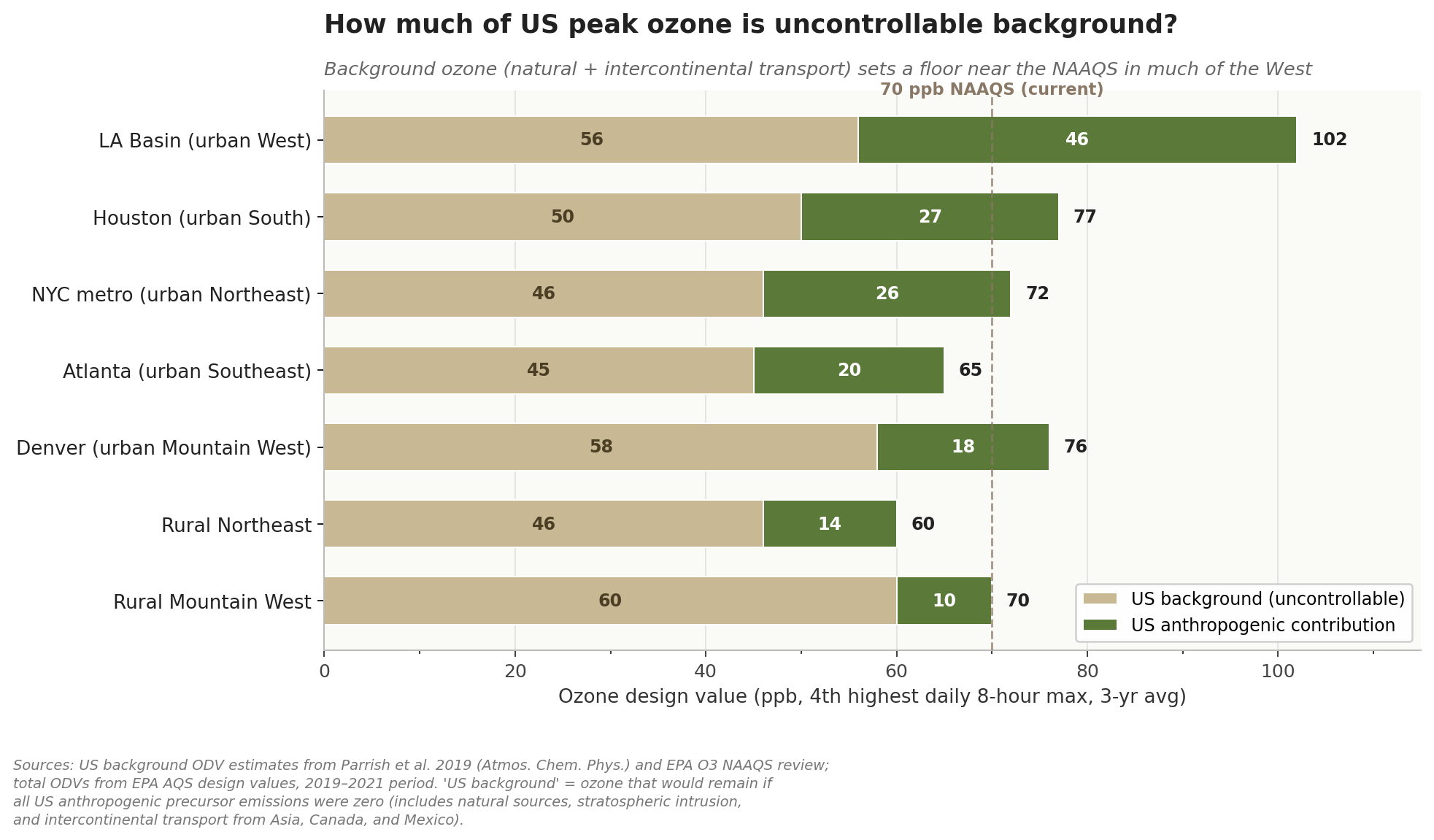
A much bigger share of US ozone is natural, or otherwise beyond our control. Somewhere between 40% and 70%21 of the ozone at ground level in the US comes from things like the upper atmosphere drifting down, trees and plants releasing gases, lightning, soil, pollution blowing in from abroad, and methane emitted around the world. This changes a lot based on where you are.
Most estimates of the harms of air pollution, like EPA’s benefit-per-ton estimates, measure in terms of the harms of the increase in the amount of air pollution rather than the total amount, because a big fraction of the total is outside our control.
American air is way cleaner than it was decades ago, and way cleaner than the world’s average
American air is not perfectly clean, but it is way cleaner than it used to be decades ago, and way cleaner than the global average.
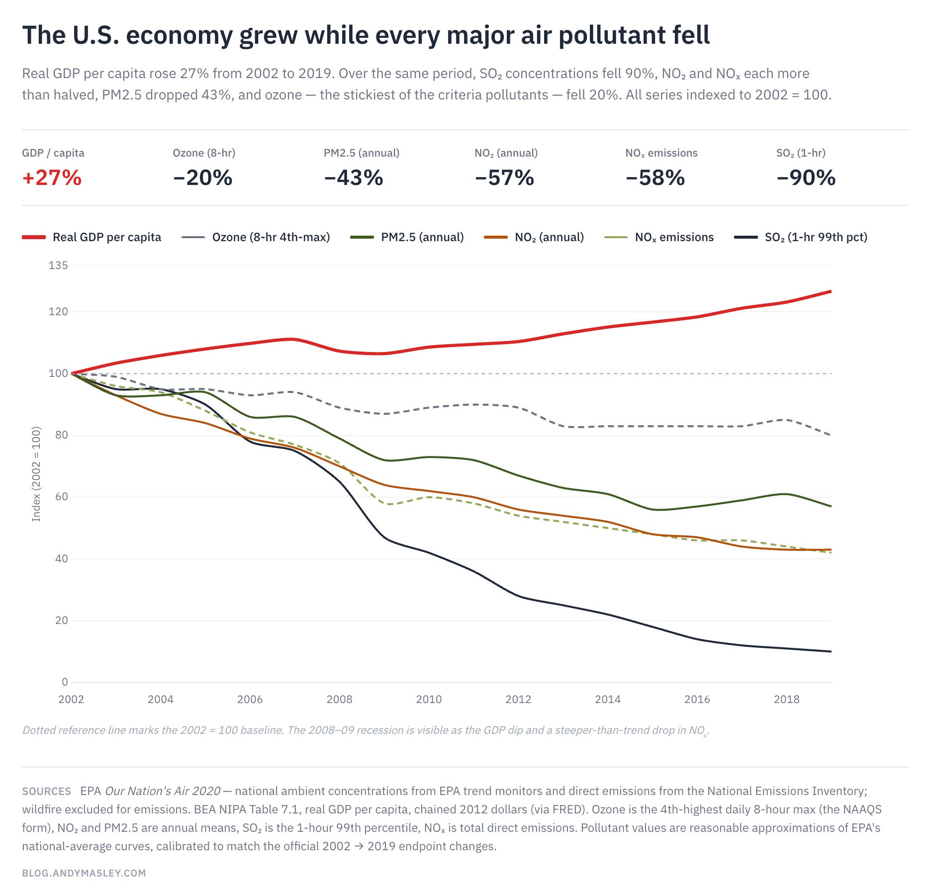
Whether you look at average PM2.5, ozone, or NO₂ exposure, or NOx or SO2 emissions, the story of American air over the last 20 years has been significant and impressive improvement, with progress still left to go, and sometimes stalling. Meanwhile the economy continued to grow as normal. We’re getting way more value per unit of pollution emitted than we used to.
These averages can also mask significant disparities in local exposure, which will be discussed below.
In general, metro areas are more polluted than rural areas. Here’s every US cities’ PM2.5 concentration compared to all global cities:
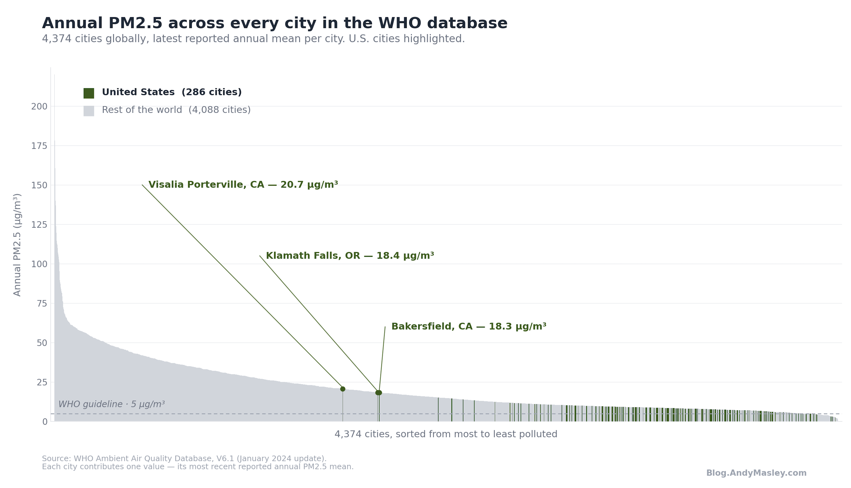
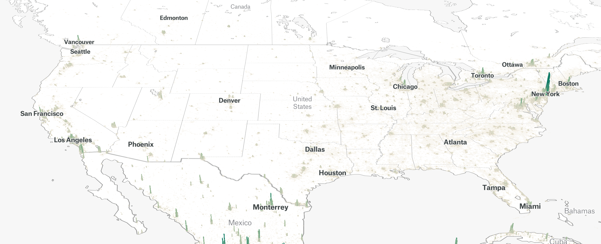
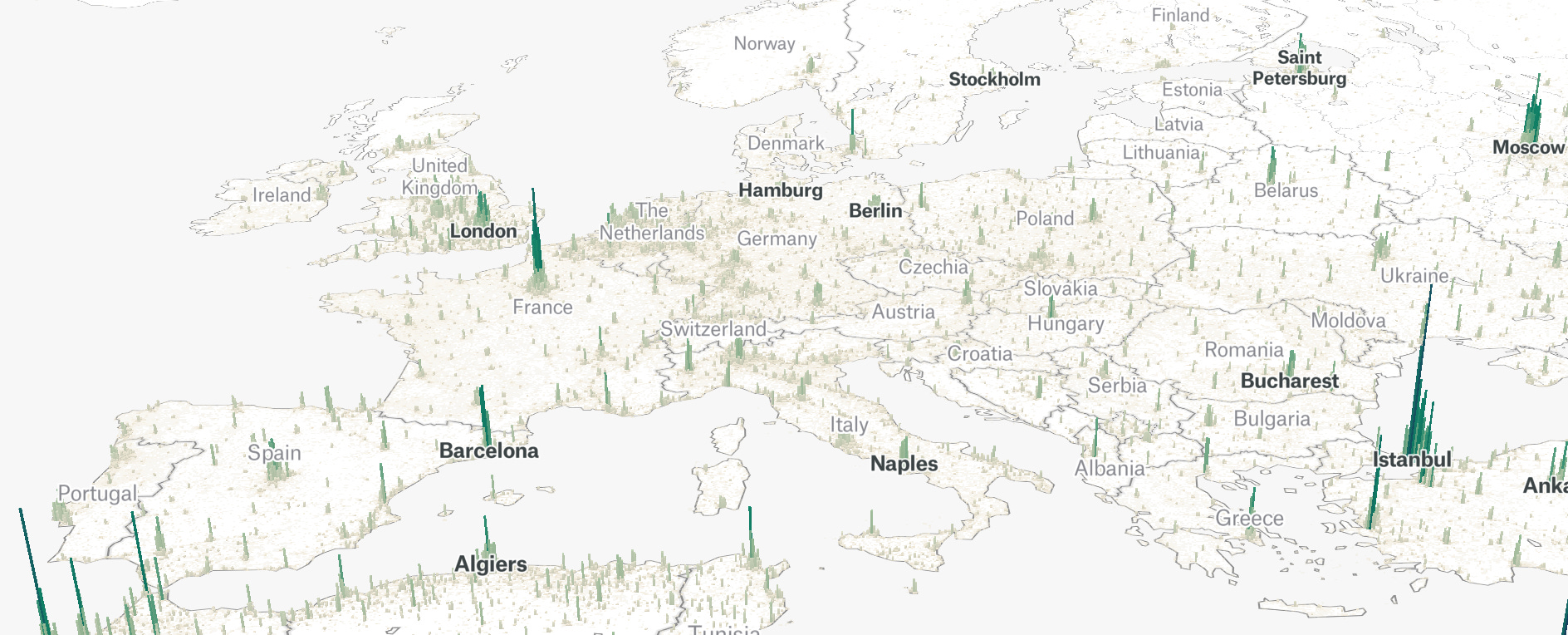
The US has it somewhat easy in managing PM2.5 exposure partly because our population density is so low. The average US citizen just isn’t living super close to huge numbers of other people all producing pollution. There are lots of other reasons, like our energy mix, wealth, and pollution controls. India and China top the global lists for PM2.5 exposure, Europe is also higher than ours on average, and if you just look at a population heat map of the regions, it becomes more obvious why they have a harder time keeping pollution low compared to us:
Other reasons India and China have more pollution than the US include heavier coal use, less emissions-control, less governance and enforcement capacity on air pollution, and different industries.
Because the global average is so much higher than the US, globally PM2.5 makes up a much larger percentage of deaths and DALYs lost than it does in the US. Globally, PM2.5 is responsible for about 7-8% of all deaths, whereas in the US it’s 1.7-2%. It’s responsible for about 5% of all global DALYs lost, whereas in the US it’s between 1.5-2%.22
US air has in general become significantly cleaner.
A lot of US pollution harms occur in either average US air quality, or California
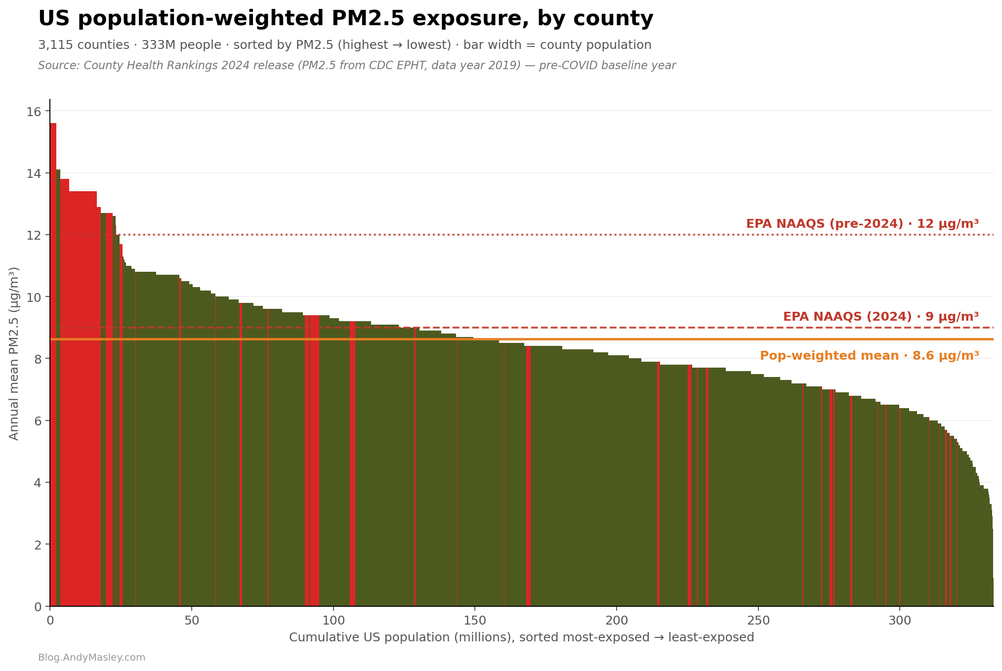
Here’s a graph of every county in America’s exposure to PM2.5 in 2019, the width of each bar is the population of the county:
I chose 2019 because 2020 is the last year we have good data, and 2020 was a weird year for air pollution in the US, both because of COVID and because of the wildfires that year.
If you’d like to see where your county shows up here, I’ve turned this into an interactive visual on my website where you can scroll through every county in the US.
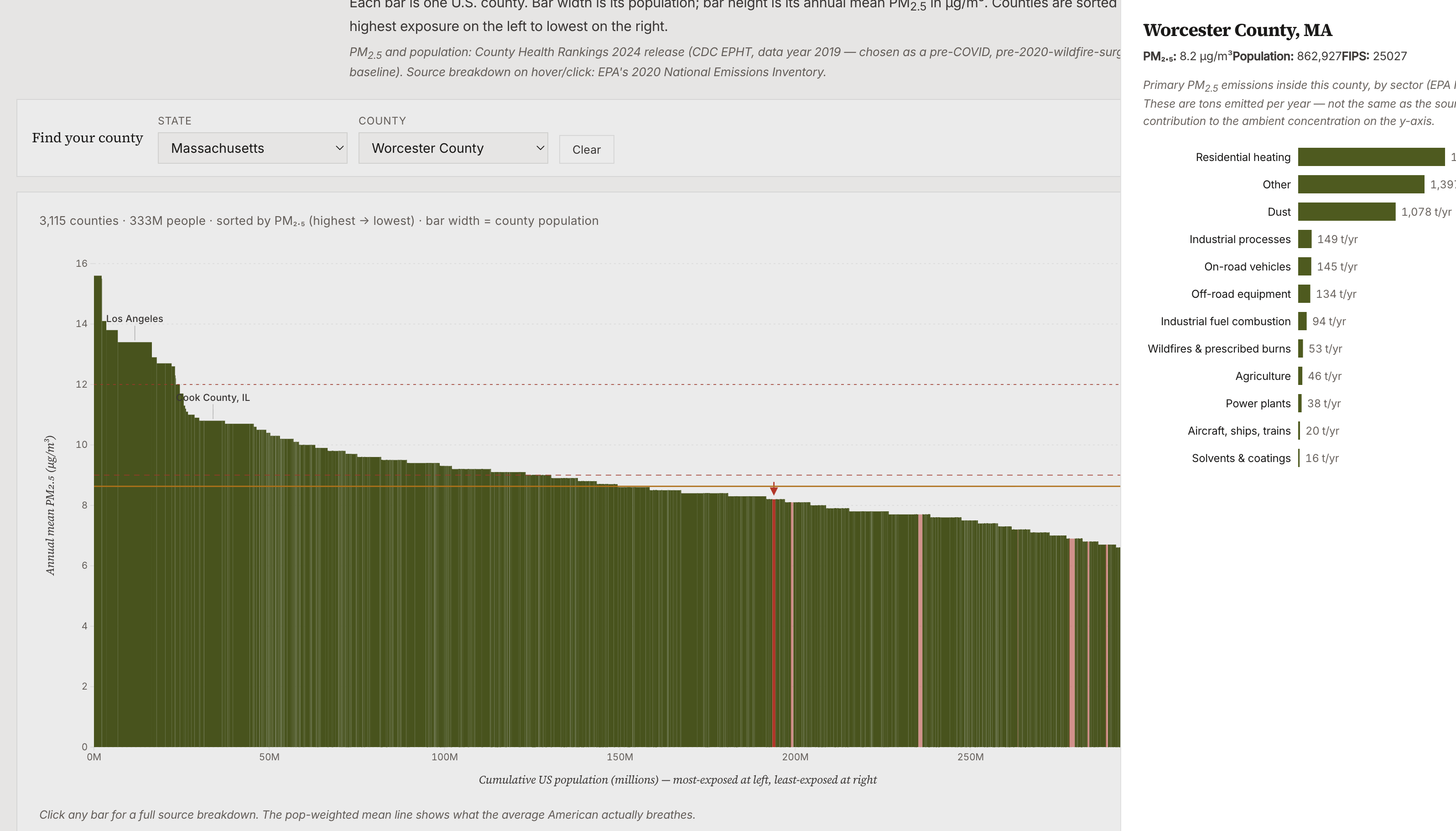
The outliers on the left are mostly in California, I’ve highlighted every California county in red.
Why is California such an outlier?
The worst air quality in California is concentrated in two bowls: the Central Valley, and the LA Basin. Both have this crazy combo where air is trapped by surrounding mountains and prevented from circulating, persistent temperature inversions keep air pollution close to the ground where people breathe, and these places get very little rain to wash the PM2.5 out of the air.
The emissions are pretty bad in both places too. The LA area has the world’s busiest port, which means a constant huge input of diesel exhaust. The Central Valley is one of the most productive agricultural regions in the world, and agriculture is a huge contributor to PM2.5 because it creates lots of ammonia that reacts with NOx. There’s nowhere else in the country that has this much ammonia, NOx from vehicles, too little rain to cancel out the PM2.5, and is inside a valley where air doesn’t circulate out.
This isn’t even including wildfire exposure. If you look at how each county changed in 2020 relative to 2019, the California counties spike even higher because it was a bad wildfire year.
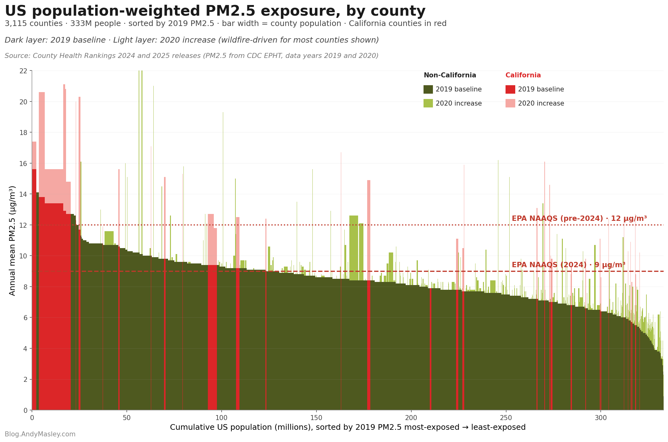
If you bracket off California’s unique air pollution situation, the vast majority of PM2.5 exposure and modeled death is happening below 10 μg/m³. This about the average air quality of Germany or the UK.
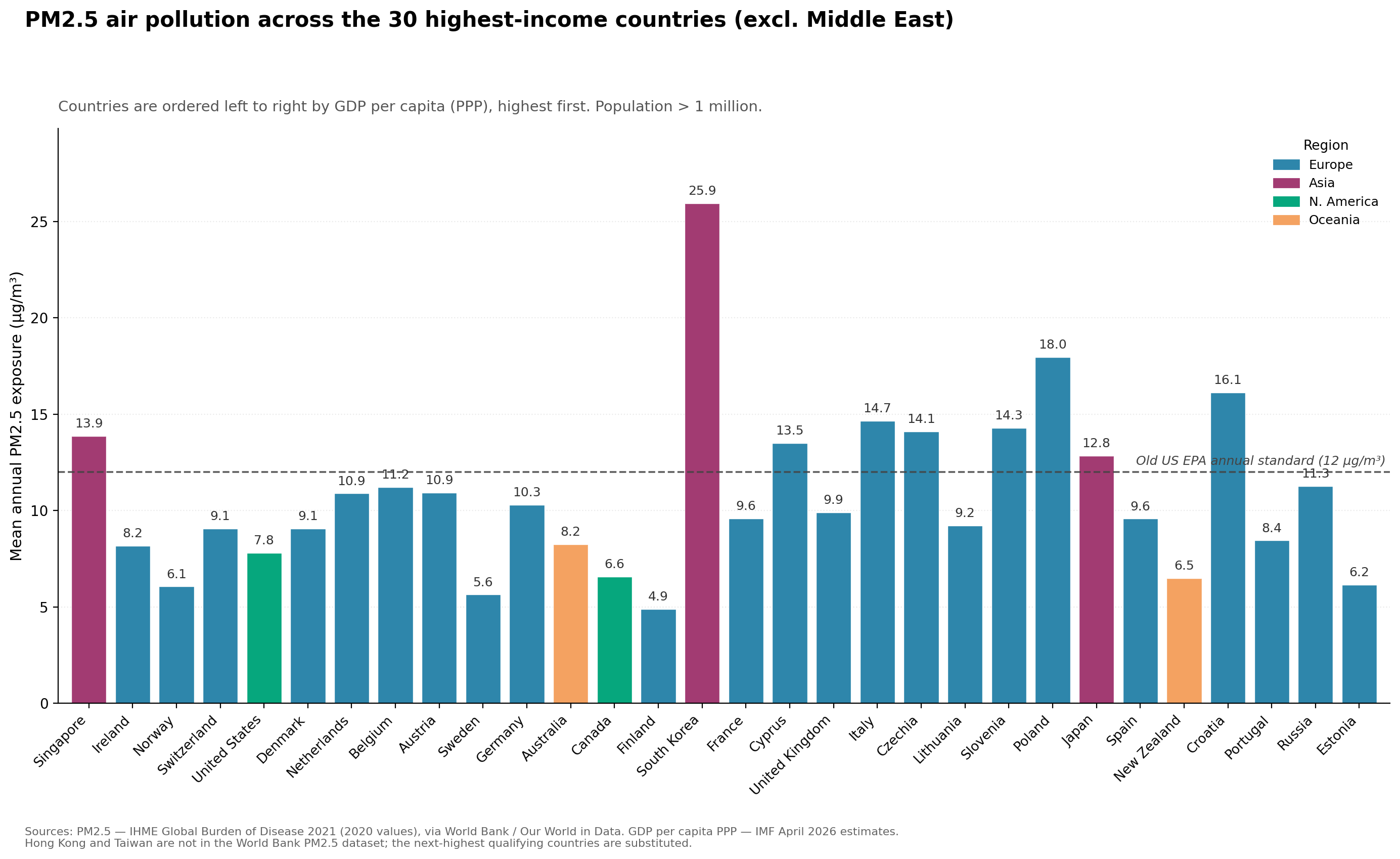
This pattern has been indicated by more scientific methods. One study estimated that 99% of the mortality burden of PM2.5 in 2017 happened at exposure levels below the EPA’s at the time 12 μg/m³ standard.
The EPA’s old 12 μg/m³ standard is about average to somewhat dirty air in comparison to other countries with comparable GDP per capita. Here are the top countries by GDP with a line drawn showing where 12 μg/m³ is, excluding countries in the Middle East because desert dust and heavy oil and gas production skew them way higher in a way I don’t think is helpful for the comparison:
Many people mistakenly believe that air pollution deaths only really happen in extremely polluted areas. They assume air pollution is only dangerous beyond some threshold. In reality, American air pollution deaths are for the most part clustered in the normal air we breathe, which is very clean by global standards, but because it’s not perfectly clean, and because air pollution carries some level of harm at any level, and PM2.5 in particular has a declining curve of harm where a lot of its total harm can happen before the air gets especially dirty,
and because so many people live in clean but still somewhat polluted air, the roughly 70,000 deaths PM2.5 causes in the US each year largely happen because hundreds of millions of people are each getting tiny increases in the odds that we die from the air we breathe, which in aggregate can add to huge amounts of total harm. Individual communities’ risk can go way up when they’re exposed to really high levels of air pollution, but most of the people being harmed by air pollution nationally are breathing pretty normal American air, which is relatively clean by global standards.
How air pollution compares in deaths and DALYs to other problems
One thing we can measure is how many deaths it causes, or how many years of healthy life it robs from people. These paint different pictures.
Air pollution in America kills more people than car accidents, but most of the people who die due to long-term exposure to air pollution are much older, and often lose a few years of expected life. In comparison, people who die in car crashes are usually way younger, and so each death causes the person to miss out on decades of life. The common measurement of life years lost is “disability-adjusted life years,” or DALYs, measuring both years of life lost to death and years spent in poorer health or wellbeing. If you die 10 years early, you lost 10 DALYs but only 1 life. If air pollution gives you a permanent illness that your life qualitatively worse for the next 20 years, you didn't lose any years of life, but we still want to try to quantify what you did lose to poorer health. The goal of DALYs is to try to capture that, using a disability weight: a number from 0 (perfect health) to 1 (equivalent to death) assigned to a given health state. Mild asthma might get a weight around 0.02, severe COPD around 0.4, terminal cancer closer to 0.5–0.6. The full DALY cost is the weight multiplied by the years spent in that state and you get years lived with disability, plus years of life lost to premature death.
If we compare deaths from air pollution and car crashes, air pollution looks much worse, but this flips if we compare DALYs, because so many car crash victims are young.
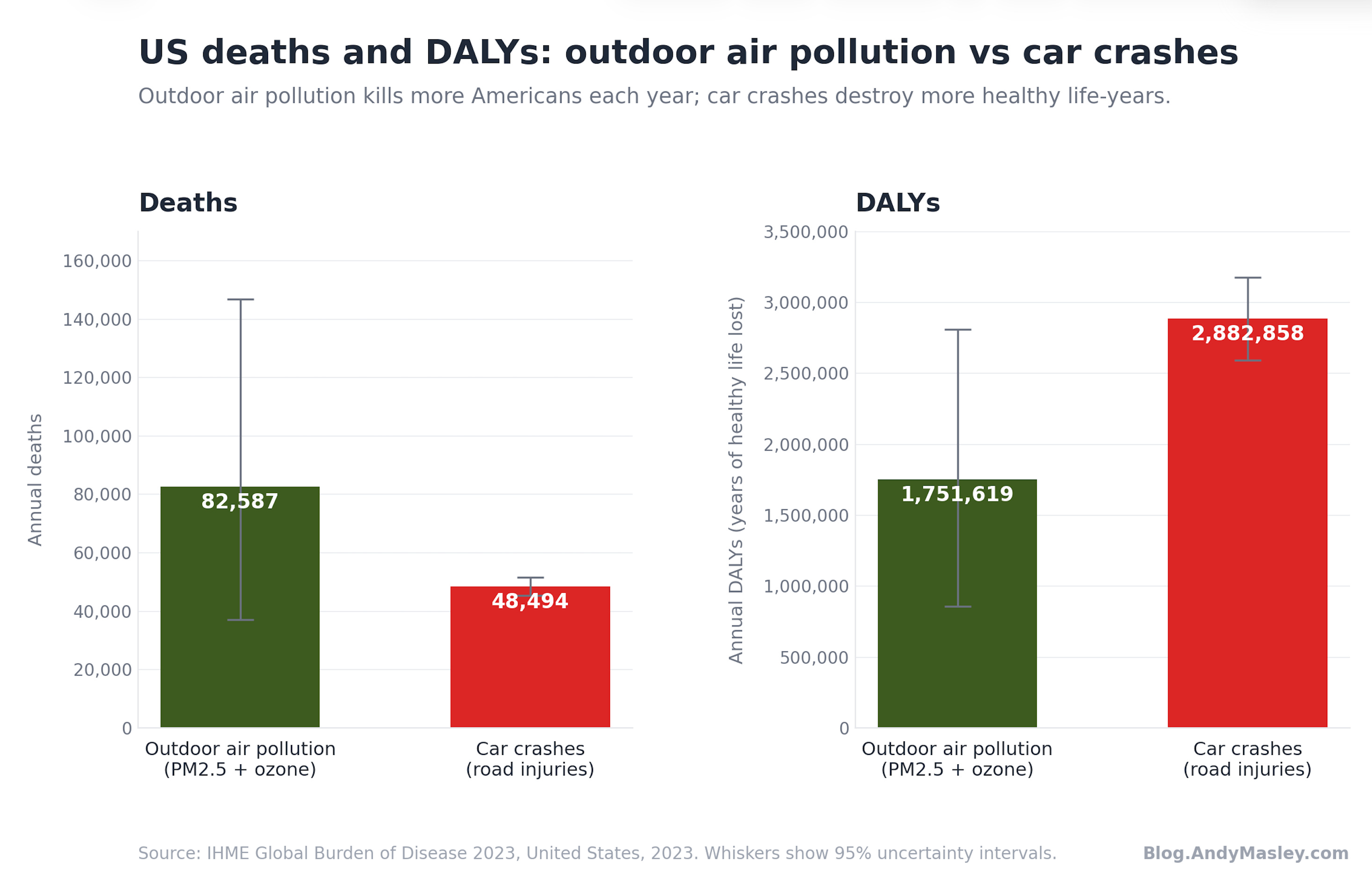
If we break up air pollution into PM2.5 vs ozone, PM2.5 becomes a slightly larger fraction of the total burden of pollution.
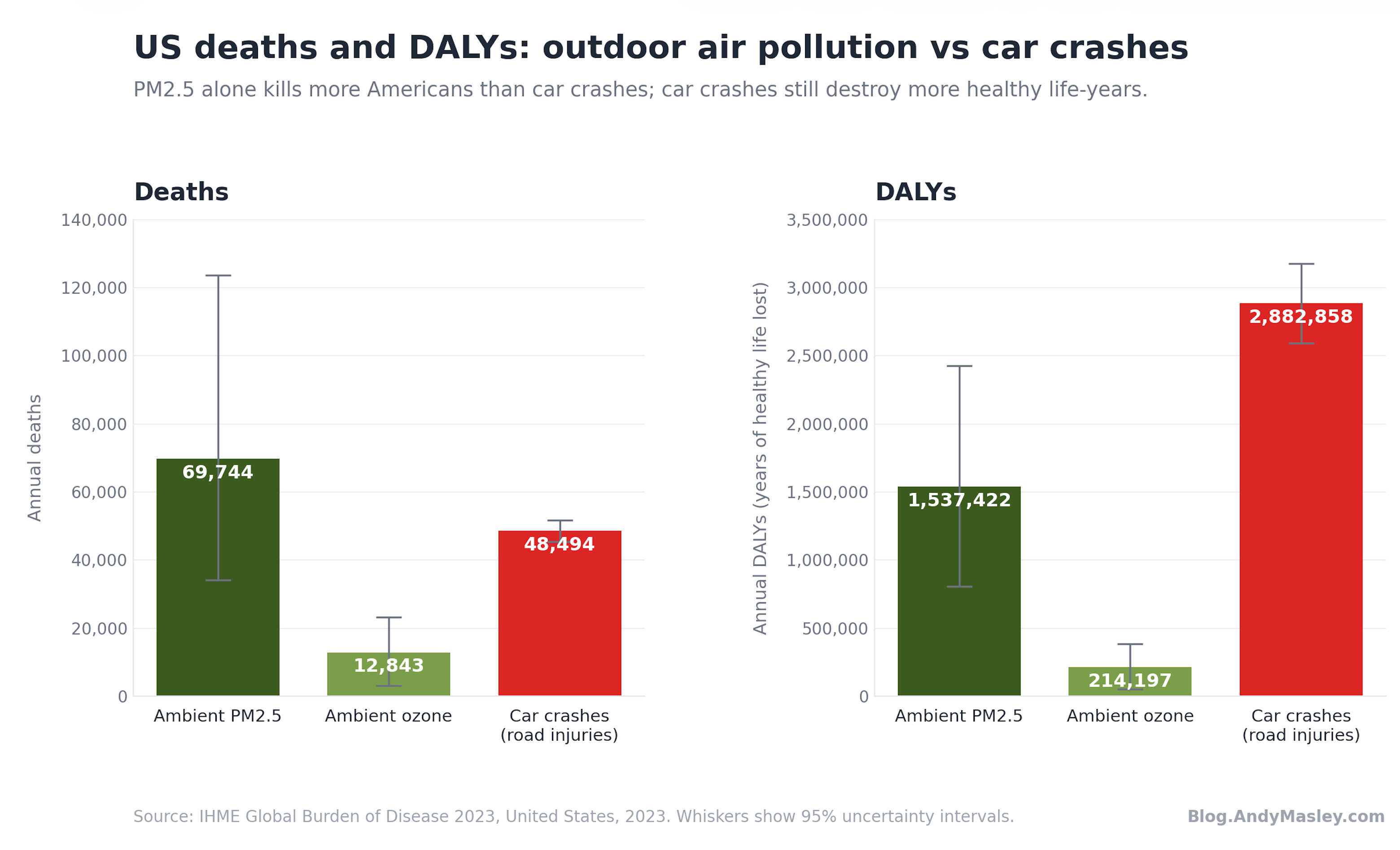
Air pollution compares differently to other problems based on whether we look at deaths or disability-adjusted life years. Either way, almost all of the harm is in PM2.5. PM2.5 costs as many life-years in America as lead exposure and interpersonal violence, whereas ambient ozone costs fewer life-years each year than choking, and just 22% as many as secondhand smoke.
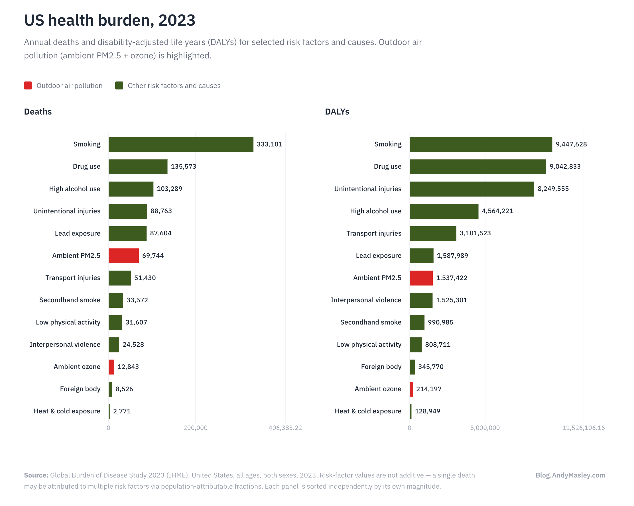
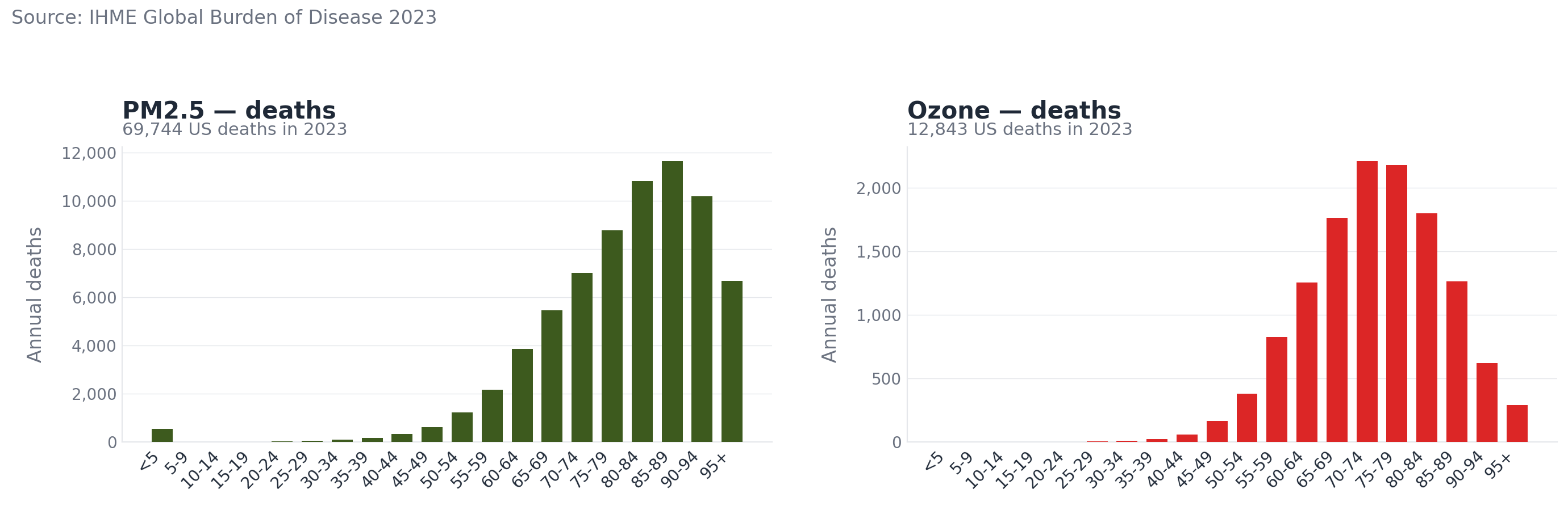
The typical American killed by long-term exposure to air pollution is over 70 and has an existing heart or lung disease. The average person whose death is attributable to PM2.5 dies about 3-4 years earlier than they would.23 Air pollution basically slowly chips away at key parts of our health, and this mostly doesn’t show up until some of us die a few years early in old age as a result.
If I live in Washington DC my whole life instead of the countryside, my life expectancy drops by about a month.24 This doesn't actually mean that I and everyone I know here will die a month early. It means that chronic PM2.5 exposure slightly raises the lifetime odds that any one of us dies somewhat earlier than we otherwise would, and across the whole population that averages out to about a month per person.
While some people die from long-term air pollution exposure younger than 65, the vast majority of deaths happen after.
When does an air pollution source have a very local impact vs a very broad impact?
When I talk about “national” vs. “regional” vs. “local” impacts of data center air pollution, you might think I’m using an accounting trick. Isn’t the national number just the sum of all the local harms? This will just look arbitrarily low because not everywhere has data centers, so they bring the average way down, right? What does this actually tell us?
This is actually wrong. Air pollution can travel for hundreds or even thousands of miles before harming people, so it makes sense to separately talk about national air quality and how it’s affected by different industries. Think back to the wildfires in Canada a few years ago and how they affected US air quality. These were broadly a national problem created by far-away PM2.5 sources rather than just a sum of local problems created by local air pollution. We can make general statements about US air quality overall that aren’t just the sum of the harms of very local air pollution sources.
The quality of the air you breathe is basically the stacked effects of the national-level, regional-level, and very local level of air quality. Different types of air pollution can affect each very differently.
The main type of air pollution data centers create, NOx, can travel tens of miles or more before producing ozone or PM2.5, and the PM2.5 can travel much farther. Many studies that focus on data center impacts on air pollution focus on how they affect national air or large regional air quality, because most of their pollutants are carried far away.
Some sources of pollution mainly harm the people immediately around them. Others mainly harm people hundreds of miles away. This matters because among other things it can mean air pollution harms are more evenly spread rather than being unfairly bunched in specific places. What determines where air pollution goes?
Four factors determine how locally or broadly a data center’s pollution harms are spread.
The first is whether the pollutants are primary (emitted straight out of the source) or secondary (the result of chemical reactions with emissions and the atmosphere). Primary PM2.5 is dangerous the moment it’s emitted, and concentrations drop off quickly with distance from the source. Secondary PM2.5 forms over hours when NOx or SO2 react with the atmosphere. Secondary PM2.5 can appear tens or hundreds of miles downwind. Ozone is almost entirely secondary. It isn’t meaningfully emitted from combustion sources and forms when NOx reacts to specific compounds in the atmosphere. NO₂ is emitted directly from sources and its short-term respiratory harms are largely local and concentrated in the plume around the source, though because it’s NOx it can go on to contribute to ozone and PM2.5 downwind.
Somewhat related, the atmospheric lifetime of a pollutant determines how long it can survive in the air before becoming something else. NO₂ often reacts within minutes to hours, NOx more broadly can last about a day, so it can travel farther. PM2.5 typically lasts about a week, and longer in some conditions, which is why wildfire smoke can cross continents and do harm thousands of miles away. Man, PM2.5 is crazy!
The height of the thing doing the emitting matters a lot too. Pollution emitted near the ground often stays near the ground, so people are more at risk of breathing it or its secondary effects. If a stack is hundreds of feet in the air it lets the pollution out into an area where wind is stronger and it can mix more with the air higher up. Basically, the higher the stack emitting the pollution, the broader the range it can travel is, so its effects are way more dispersed. Sources close to the ground can harm very local air much more.
Finally, a lot just depends on local conditions. Valleys can more easily trap pollution locally and concentrate it. Background chemistry in the air determines whether NOx creates or destroys ozone. Secondary PM2.5 forms much more easily when there’s ammonia in the air from agriculture.
This can create problems for thinking about the ethics of air pollution, which I’ll write about more in Part 2. Two air pollution sources can do the same amount of very general harm, but if one spreads that harm by increasing the risk of a huge population in a big area by a tiny, tiny amount, it seems ethically different than if it concentrated all that harm on a very local area. This is a place where general harm reduction on its own doesn’t tell us much and we need to think about egalitarianism and past injustice as well.
So the question of how data centers impact your air quality actually depends on three overlapping questions: How do all national data centers harm national-level air quality? Regional-level air quality? And very local air quality?
The full effect of data centers on the air you breathe is the stack of all three.
Comparisons between different pollution sources are often counter-intuitive
I think almost all comparisons between different sources of air pollution are so counter-intuitive that you can basically never rely on them to give you a good sense of how harmful something is.
Take cars. Cars today emit shockingly little PM2.5. Their PM2.5 emissions are so low that they “emit” about as much via their tires making contact with the ground as from burning their gas, sending little bits of tire and dust into the air. They emit NOx, which mostly creates ozone, and some secondary PM2.5. But even their NOx emissions are much lower than they used to be. Old cars used to be way way worse, but catalytic converters are just really good now and combust most of the air pollution before it’s emitted. A new truck emits roughly 99% less hydrocarbons per mile than a 1970 pickup truck.25
We still think of cars as causing huge amounts of dangerous air pollution, so if you read that something is emitting as much air pollution as “thousands of cars” it sounds like a disaster, even if it actually fades into the background of what’s actually causing harmful air pollution.
Let’s say you’re given two options for what will happen near your home:
Someone using a gas-powered two-stroke leaf blower nearby for 1 hour.
Someone driving a truck in circles around your home over and over for 300 miles.
Which would be worse for your health?
Turns out it’s the leaf blower. A modern truck is the result of 50 years of advancements in pollution controls and tightening emissions rules. A two-stroke leaf blower has minimal emission controls, it’s basically a small, dirty engine with a fan attached.
The pollution that does the most damage when you’re right next to the source is primary PM2.5. One hour of the leaf blower puts about 15 grams of PM2.5 into the air around your home. The truck over 300 miles emits roughly 4 grams, even after including tailpipe soot, brake dust, and tire wear. The leaf blower wins by ~4×, even though it’s running for one-fifth as long.26
When you think about it this makes intuitive sense. Imagine what your city would smell like if everyone you saw driving were using a leaf blower instead.
This leads to a lot of confusing comparisons for air pollution. Take this quote from Newsweek on the study I mentioned above:
The researchers estimated how much air pollution might arise from the computing work that goes into training some AI large language models. They found that training a model the size of the Llama 3.1, launched this summer by Facebook parent company Meta, could produce the same amount of pollution as 10,000 cars driving round-trip between Los Angeles and New York.
How much air pollution is 10,000 car trips between LA and New York? Sounds like a lot! But cars are a terrible way of doing air pollution comparisons, because they now emit so little, but we still think of them as emitting a lot.
This study is only looking at the PM2.5 produced by cars, not the ozone. 10,000 cars driving round-trip between LA and NYC emit about 500 kilograms of PM2.5 in total. That’s roughly equal to about one hour of NYC’s commercial cooking emissions, two or three days at a mid-sized cement plant, a single large cruise ship idling in a harbor for a day, or the winter heating emissions from about 10 American homes that burn wood for heat.27 Not nothing! But these paint a very different picture than “10,000 cars driving thousands of miles.”
Climate change has many pathways to create more air pollution, so a source’s main effect on air pollution is often via its effects on climate
There are a few ways climate change puts us at risk of more local harmful air pollution:
Increasing chances of wildfires, which are just so uniquely bad for PM2.5 exposure.
Higher temperatures accelerate the types of reactions in the atmosphere that produce ground-level ozone from NOx.
Drought and soil aridification increases windblown dust PM2.5.
Longer growing seasons which worsen exposure to pollen, which can interact with PM2.5 to create worse respiratory harms.
Consistent heat can trap pollutants near the surface for longer stretches.
Combining these all implies that, because American air pollution sources have radically cut their PM2.5 and NOx emissions compared to a few decades ago, but are still emitting lots of CO2, for many already-clean sources the CO2 channel plausibly does as much or more damage to US air as their direct PM2.5 and NOx, even before we count effects outside the US.
A back of the envelope calculation for how these compare for a Toyota Corolla and a grid-scale gas plant suggests that the Corolla creates 2-8x as much modeled health harm from PM2.5 in America via the effects on climate of its CO2 emissions compared to the PM2.5 it actually creates directly in the atmosphere28. For a modern gas plant it’s 3-10x29. This is mainly a story of us getting very good at removing PM2.5 from pollution sources, but not good at reducing CO2 emissions.
Most climate-driven wildfire and ozone mortality currently lands in South America, Australia, India, and Eurasia, not the US,30 so the harms are many times greater there. This implies that the main thing to worry about for net air pollution harms from an emitter at the national level is actually its CO2 emissions, not the direct harmful-to-breathe pollutants it creates in the atmosphere.
So I’d expect a really huge part of data center effects on air pollution to actually be via their effects on climate. Climate’s complicated enough that I’ll save the full deep dive on this for another post.
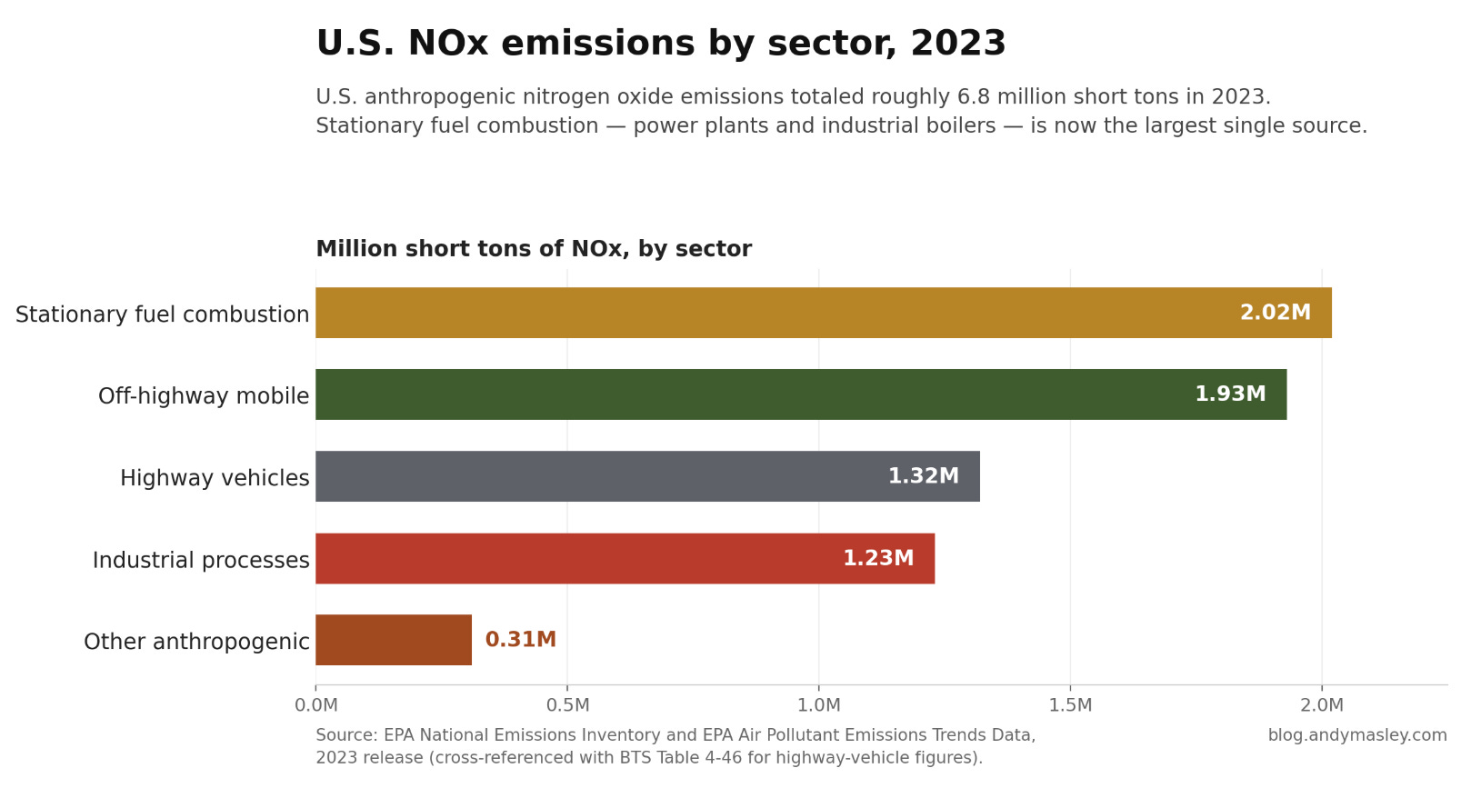
The main sources of outdoor air pollution in the US, and their decline
PM2.5
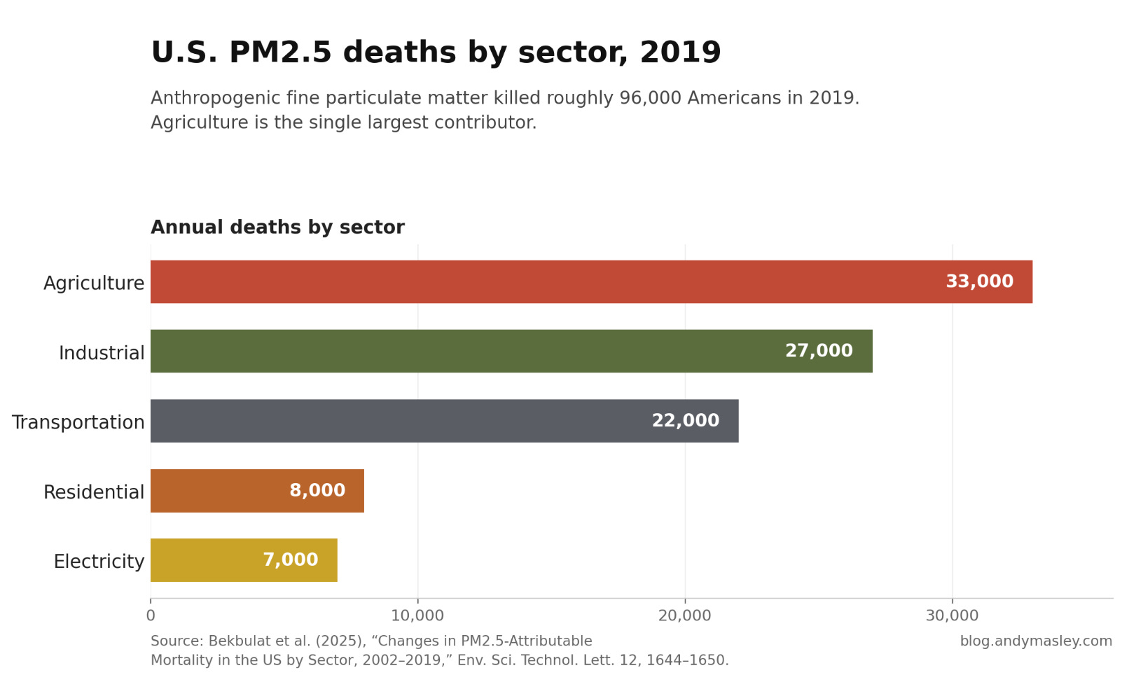
The most recent study of deaths from PM2.5 (both primary, emitted at the source, and secondary, created by other emitted pollutants like NOx) by sector was in 2019. I’ve made a chart comparing the deaths in 2019 to 2002 to show how much safer different sectors have become, all from this study.
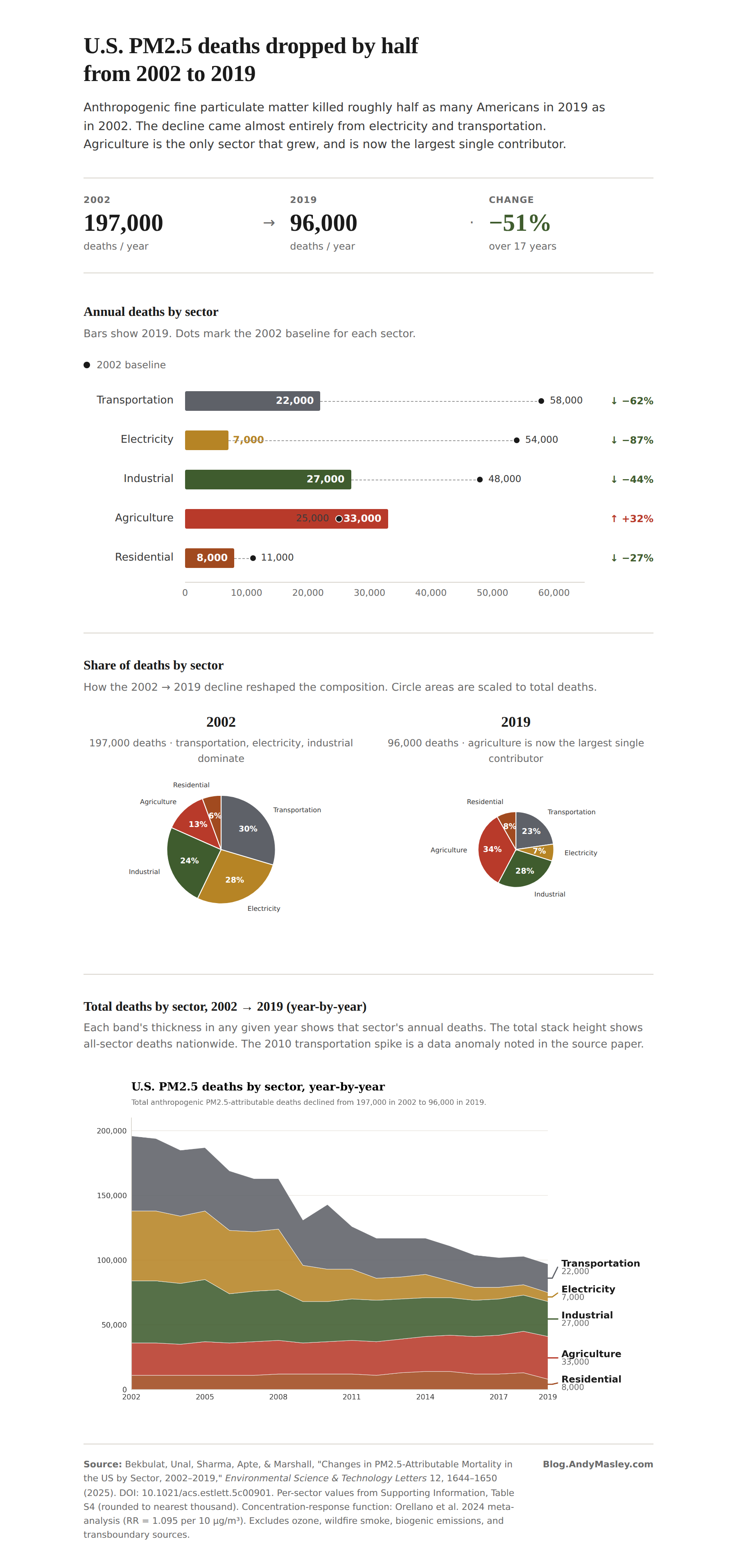
PM2.5 deaths have dropped in America. There were twice as many in 2002, and coal-electricity deaths specifically have fallen 89%. This mainly came from a cleanup of the electricity and transportation sectors.
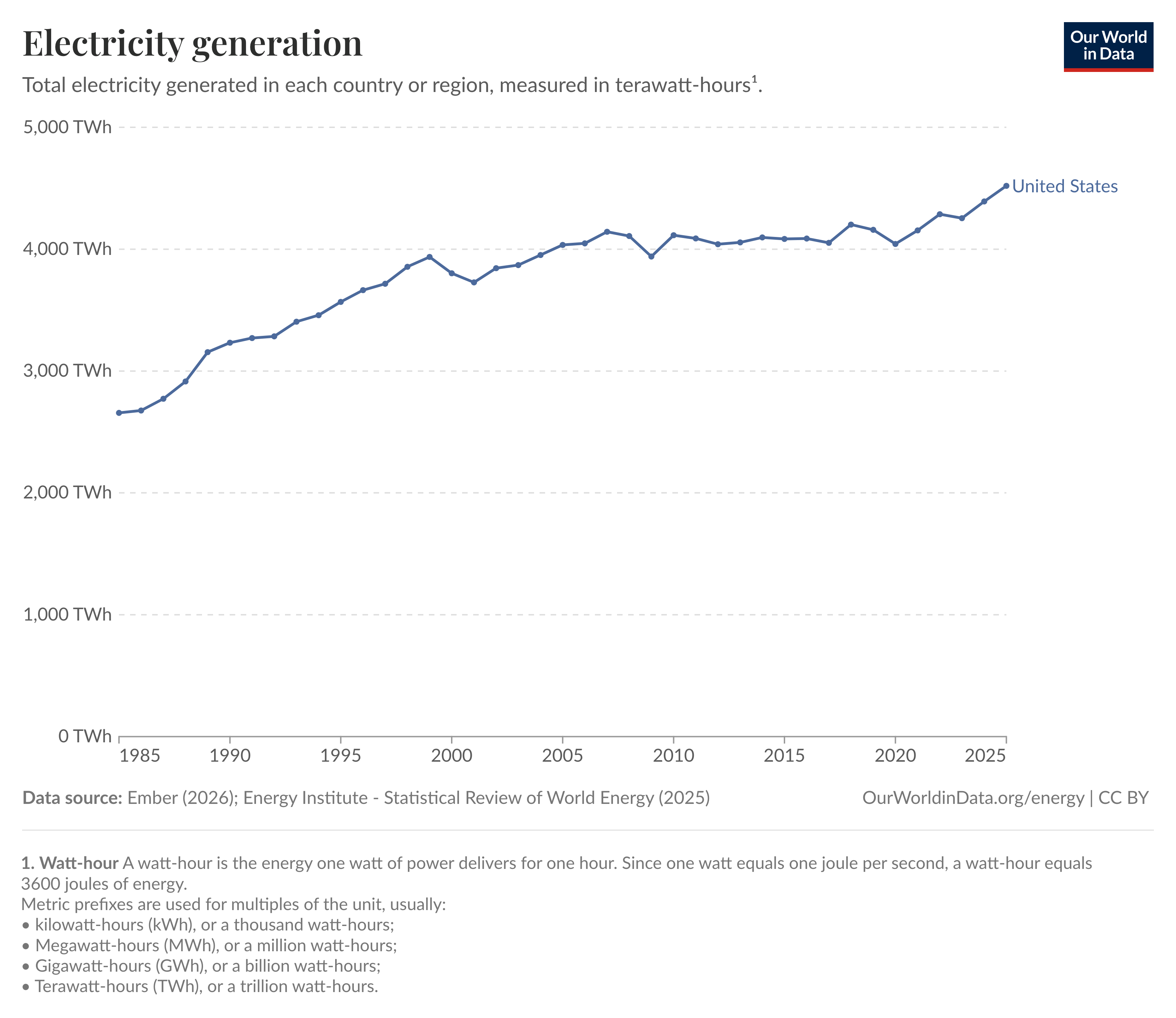
The drop in electricity sector pollution deaths isn’t attributable to using less electricity, because we were using 8% more in 2019 than in 2002:
The authors find that natural gas, oil, and biomass collectively killed about 1,000 people a year through PM2.5 in 2019. Coal killed about 6,000. Comparing these numbers to how much electricity each generated in 2019, coal kills about 6.3 people per TWh, and gas, oil, and biomass collectively kill about 0.6 people per TWh. This implies that if in 2019 we had replaced all coal with gas, oil, and biomass, something like 5,400 people’s lives would have been saved from air pollution, bringing the total deaths from PM2.5 from electricity generation down from about 7,000 to about 1,600 per year. Remember that coal also produces SO2, which creates PM2.5 about twice as dangerous as average, so the gains from displacing coal are bigger than the deaths-per-TWh ratio alone suggests. A grid made up entirely of natural gas over coal would involve way fewer pollution deaths.
Putting pollution controls on coal plants, and swapping out coal for natural gas, have together been one of the biggest positive wins for air pollution. The rise of renewables have also played a role here, as have better pollution controls on coal plants. This is the year-by-year estimate of deaths from electricity-sector PM2.5 compared to the grid makeup over the same time:
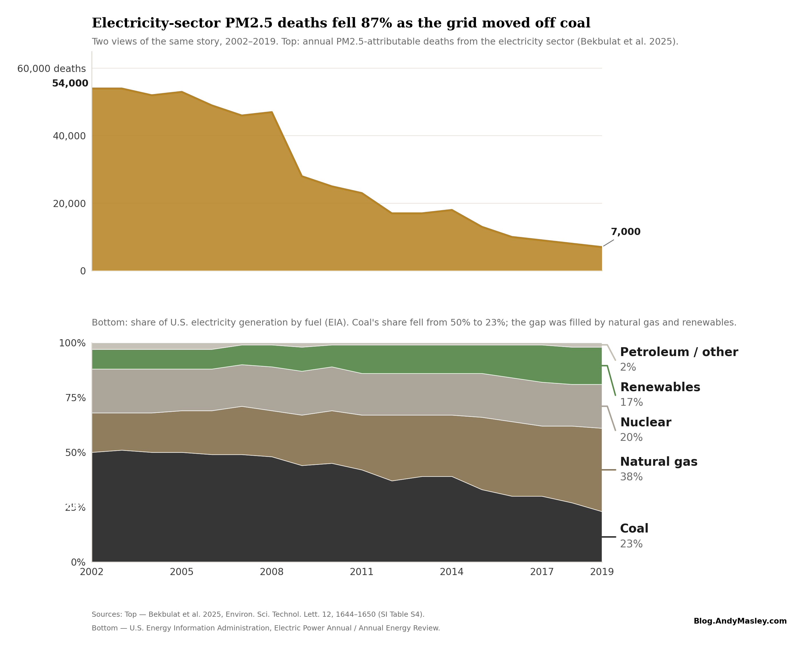
You might notice that the chance in mortality drops off fast around 2008, despite coal not budging much. This is because around this time the Clean Air Interstate Rule from 2005 had forced a big retrofit of coal plants with much more effective pollution controls.
How has the American grid changed since 2019? As of 2024, coal generated 33% less energy, so modeled PM2.5 deaths from electricity generation were likely lower than in 2019, and dramatically lower than in the early 2000s.31
Obviously your takeaway here absolutely should not be “gas is always good.” We eventually need to move from gas to renewables, and gas is especially bad if turbines are built very close to people’s homes. The data center buildout more broadly is seeing a huge uptick in natural gas demand that wouldn’t have otherwise happened, and this is a big loss for air quality and climate. None of this is lessened at all by good vibes gas has built up by replacing coal. But I do think your takeaway should be “coal being replaced with gas specifically is so so so preferable.” Thousands of additional people don’t die every year because of the rise of natural gas replacing coal. We can continue that trend by over time replacing gas with cleaner sources, but natural gas has been a vital stepping stone in reducing huge amounts of death and sickness along the way.
Ozone
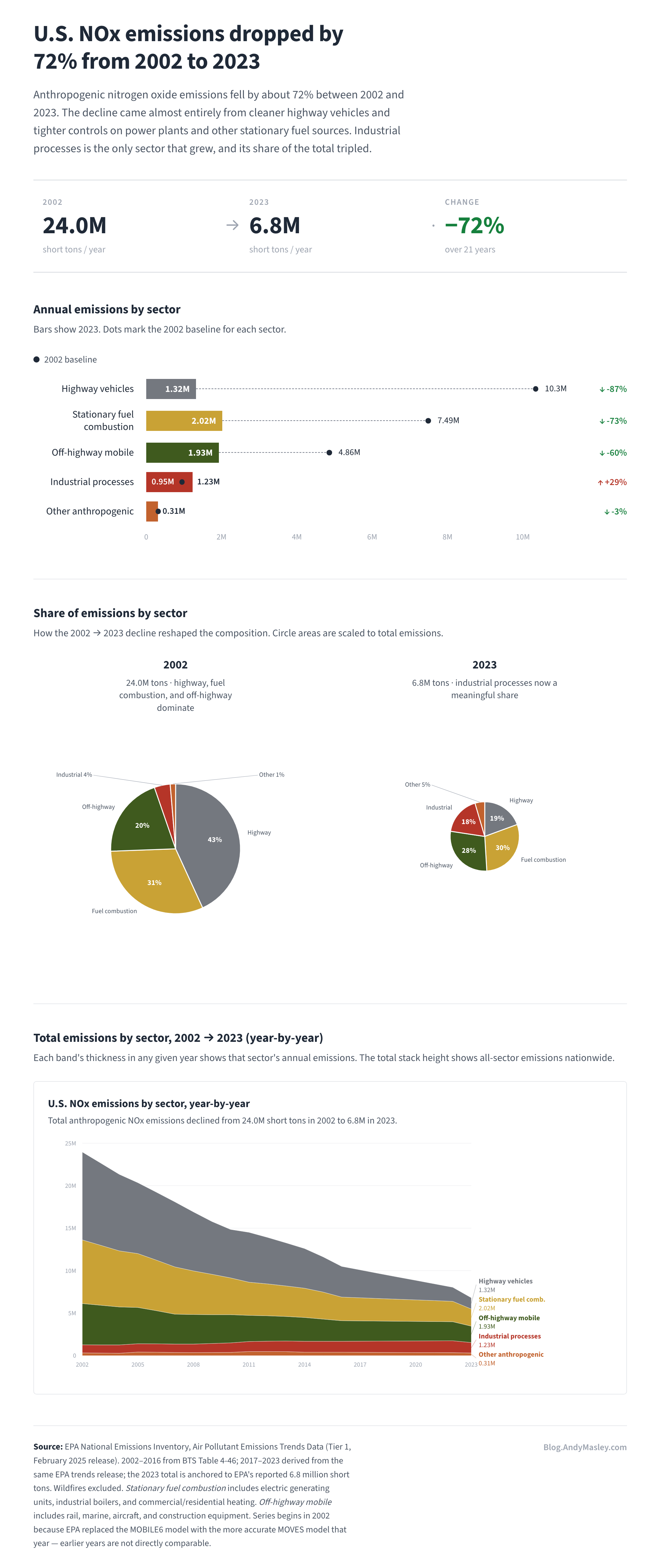
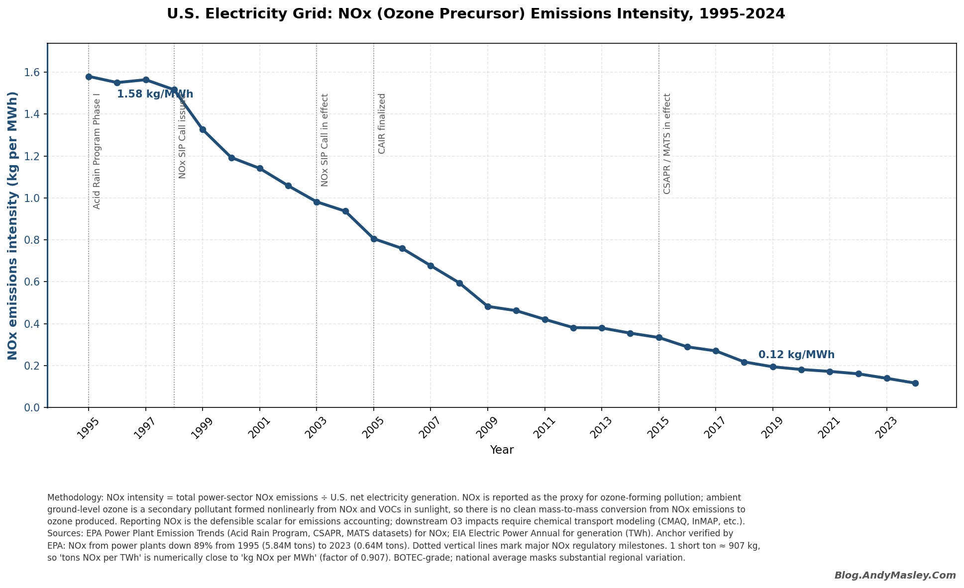
Remember that ozone is responsible for a much smaller portion of US deaths than PM2.5, maybe 14,000 to PM2.5’s 70,000. We don’t have any direct way of tracking which industries are most responsible for ozone, because the way it forms depends on atmospheric conditions and the availability of volatile organic compounds. The best we can do is track NOx emissions (which produce ozone) by industries over time. These have significantly fallen over the past 20 years, and the decline came almost exclusively from cleaner vehicles with better catalytic converters, better controls on coal plant emissions, and the general decline of coal.
Total ozone declines have been significantly less dramatic than NOx declines:
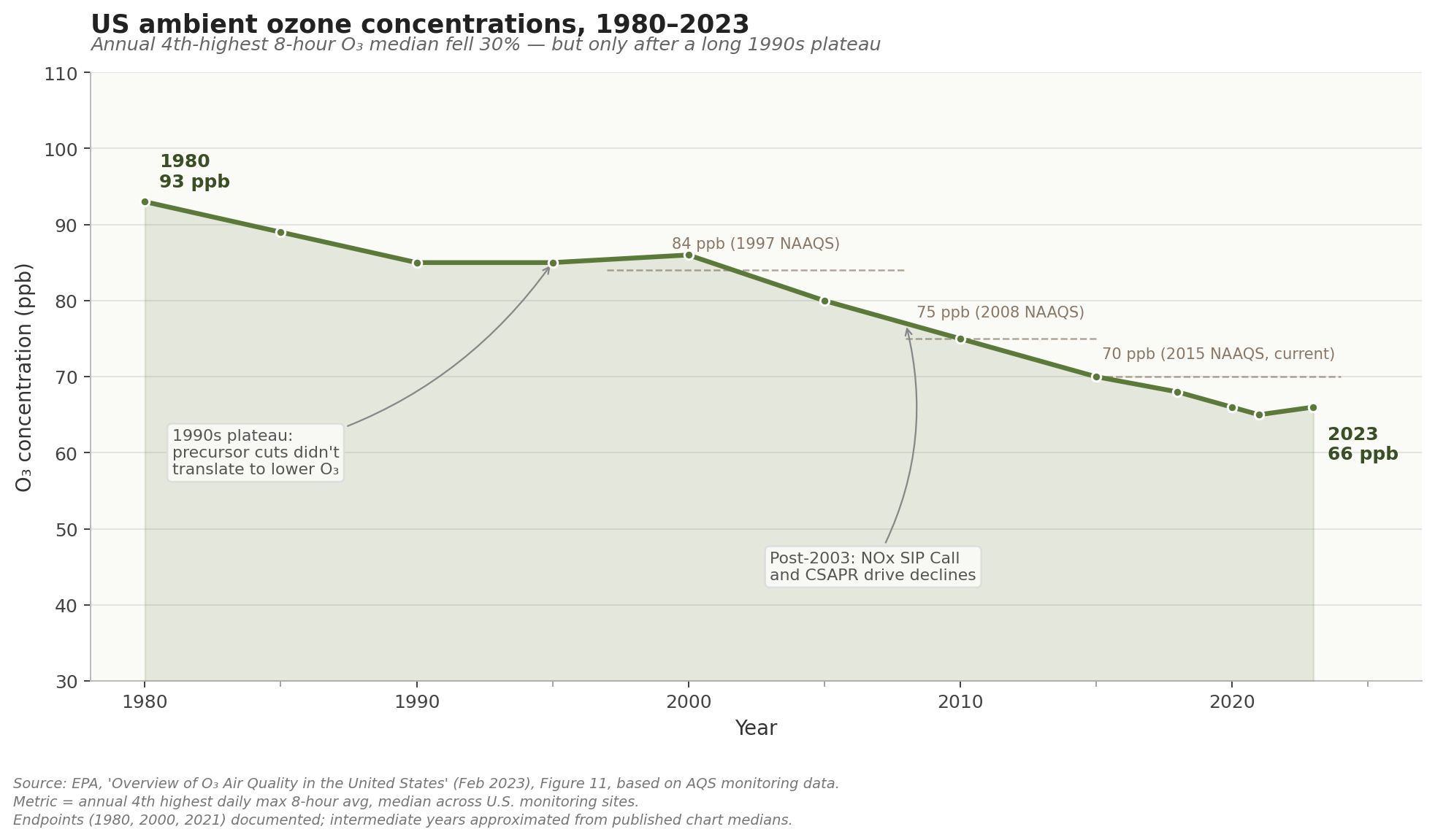
But this is largely because there’s a lot more uncontrollable background ozone we can’t cut by reducing emissions.

Quantifying the public health cost of air pollution
When people say air pollution creates “$x billion in public health costs” they don’t usually mean that actual people are paying this amount in hospital bills or other costs in their daily lives. Instead, this cost comes from someone putting a dollar value on human life in general, and multiplying it by how much human life will be lost in expectation to air pollution.
This dollar amount is the “value of a statistical life” or VSL, which is modeled off what people are collectively willing to pay for small reductions in their mortality risk. The VSL EPA uses is $7.4 million in 2006 dollars, updated for inflation to something around $12 million today.32
One popular tool for estimating harm from pollution is EPA’s COBRA, short for CO-Benefits Risk Assessment. It estimates how much PM2.5 and ozone a pollution source creates, applies that added risk to each county’s death rates by age, counts the resulting total expected number of deaths, and multiplies them by the value of a statistical life.
Here’s an example to get it across, though it’s simpler than the actual math COBRA uses: if you released an extremely toxic form of air pollution around 5 people, one of them is old and has a 50% chance of dying from it, and the others are young and each have a 10% chance of dying, this model adds up the total odds of death among the 5 people, (0.5 x 1) + (0.1 x 4) = 0.9, and considers this to mean that in expectation 0.9 people will die. It then multiplies by the value of a life (around $12 million) to get a final cost of 0.9 x $12 million = $10.8 million. So COBRA would say releasing this extremely toxic form of air pollution around the 5 people had a health cost of $10.8 million. Notice that this isn’t the cost of taking care of the people, it’s saying a human life is worth $12 million, and multiplying that out.
COBRA isn’t measuring actual deaths here, it’s measuring statistical deaths. If 150,000 people each face an added mortality risk of 0.001 percent, the model counts that as 150,000 x 0.001% = 1.5 statistical deaths. It’s a measure of expected value, because we can’t actually trace who died of air pollution. Expected value calculations are very good and should be the basis of way more decision-making.
COBRA also attempts to put a dollar value on non-fatal health conditions that make life worse and are caused by air pollution, like non-fatal heart attacks, respiratory and cardiovascular-related hospital and ER admissions, and asthma. However, EPA’s recent analysis finds 85-95% of the monetized harm of polluted air comes from premature deaths, not other health conditions.33
COBRA does not consider how many life years were lost due to air pollution deaths. It values the death of an 89 year old and a 30 year old equally, at the same $12 million. I think this is weird, because we obviously don’t think this way about our own lives. Suppose you were going to be forced to play Russian roulette, where you had a 1/6 chance of dying. Would you rather that happen when you were 30, or 89? If you could pay money to make it happen at 89 instead of 30, how much would you pay? If you’d pay more than zero, it shows you put a dollar value on those extra years instead of just wanting to pay to avoid death in general.
The EPA knows this is a tension, and there are different reasons for why they use the model they do, but one of them is political. In 2003, EPA tried using an age-adjusted value in a Clear Skies analysis where it ranked the lives of people over 70 as having a slightly lower dollar value. Critics in government and the media called it a “senior death discount,” and EPA dropped it.34
Different organizations have attempted to price the full health cost of US air pollution using models similar to COBRA. One study put PM2.5 damages at $886 billion and 107,000 premature deaths in 2011. Another estimated $790 billion in 2014, roughly 5% of GDP, falling by more than 20% from 2008 to 2014. A third landed at about $1 trillion. And one COBRA study found that zeroing out emissions from the six main energy-related sectors alone would yield $608 billion in annual health benefits and avoid 53,200 premature deaths, without even including agriculture or wildfires. The models converge, roughly, on a full anthropogenic price tag somewhere around $1 trillion adjusting for inflation. This is about 1/30th of US GDP.
But we’d probably not choose to actually spend 1/30th of US GDP to reduce air pollution as it exists right now, and so it’s hard to compare these numbers to other costs, and spending this money elsewhere would save way more lives. We also don’t usually behave like pollution harms measured this way should actually be paid for by the people who create them. A few hours of a typical fire in a fireplace imposes something like $15–17 in damages on the surrounding community, because wood puts out so much PM2.5. We don’t actually expect people to be taxed $20 per use of their fireplace.35
The study that I quoted at the beginning that mentions ‘$20 billion dollars in health harms from data centers’ is called “The Unpaid Toll” which sort of implies data centers ought to actually pay for this toll or something similar. But this isn’t a standard we hold any other industry to. We can and do tax externalities, but often not at the level these health cost models imply we should.
Surface area and population
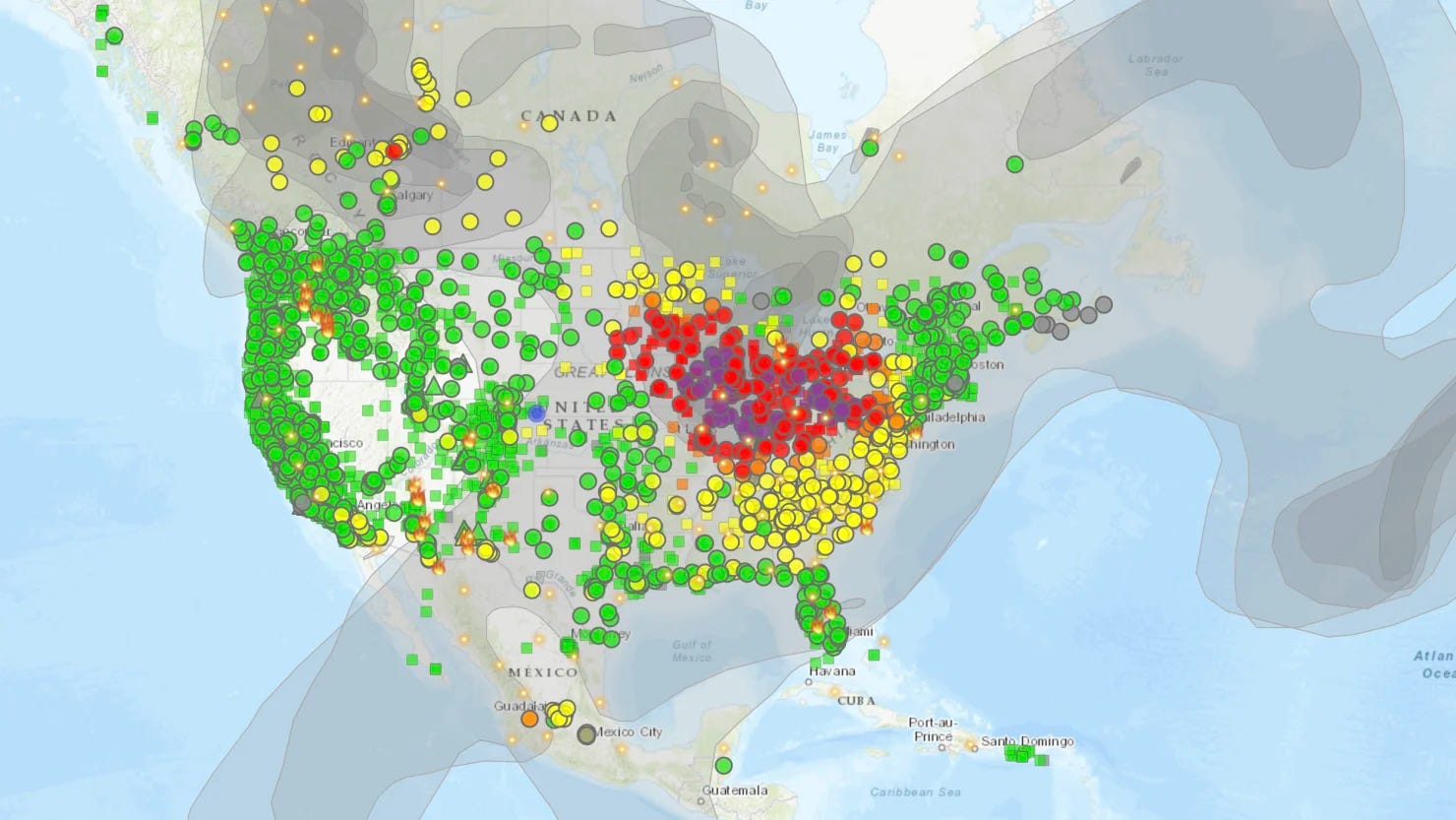
Models like COBRA measure harm in dollar amounts by multiplying the number of people exposed to pollution by the additional risk the pollution adds. This means that if air pollution hits a city, it’s measured as way way worse than in a rural area, because way more people are exposed to it. This obviously makes sense, but a weird result is that because air pollution spreads so far, maps of air pollution harm largely look like population density maps.
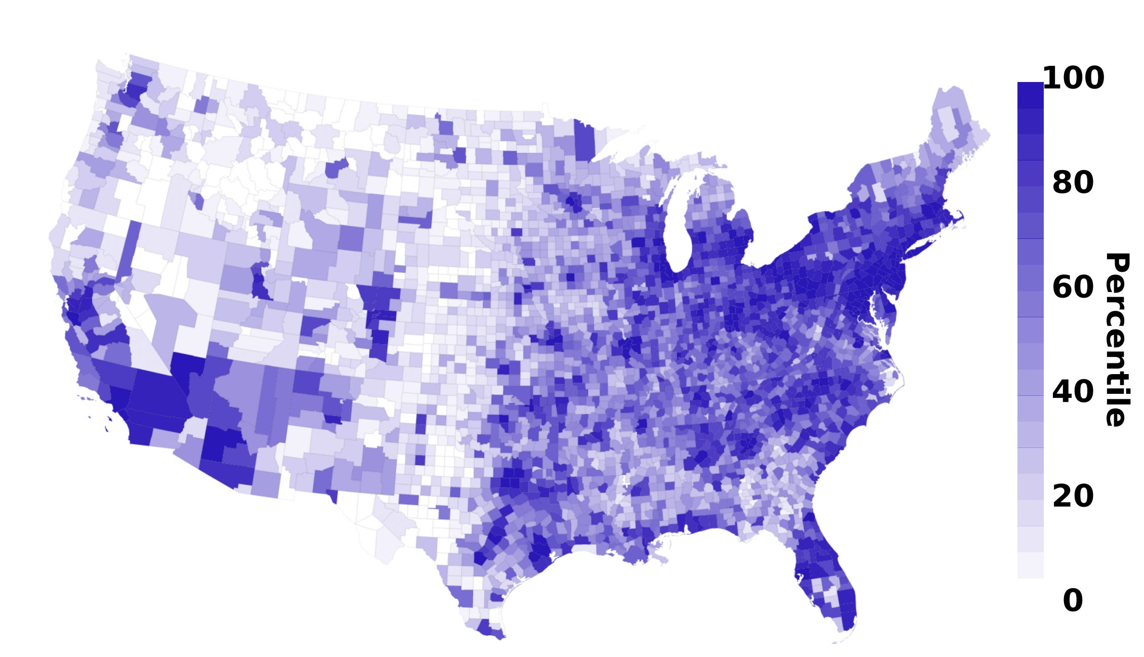
Here’s the map of data center air pollution harms from the study I mentioned in the beginning:
I made a population heat map by percentile using a similar color scheme:
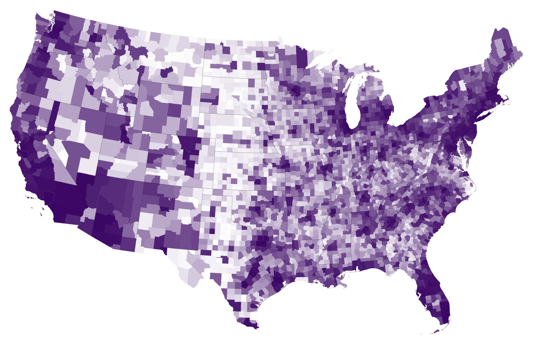
So the first is mostly also just a population heat map. The reason data center pollution shows up across so much of the country is that NOx travels far before forming secondary PM2.5 and ozone downwind, and these are the main harms of data centers. Basically, if a fossil power plant within 100 miles of you is generating any extra electricity because a data center is on the grid, that plant’s air pollution is going to show up as an extremely tiny but real increase in your daily risk. Almost every American lives within 100 miles of one of the thousands of data centers and the plants serving it, so a map of who’s being harmed by data center air pollution ends up looking almost exactly like a normal population map.
These maps can be useful at times, but don’t give you a sense of the scale of this problem compared to most other sources of air pollution. If an incredibly tiny cost is spread across all of America, then in total it will look large, and a heat map of where it’s having the most impact mostly just tells us where people live.
All air pollution harms expressed in dollar amounts at the national level always look bad in isolation
The singular sin of bad environmental writing is giving people contextless large numbers, and any model that quantifies harm in dollars over huge aggregates is very good at generating them. It’s very common to see people talk about “billions of dollars in harms” without actually clarifying how this compares to other things we do. I’m not saying here that you should assume billions of dollars in harm is small, just that you should try to contextualize it with other issues we’re facing.
Suppose that an industry causes $1 billion in public health costs to America overall each year. Should we ban it? Well, any small increase in relative harm multiplied over lots of people and then multiplied by the full money amount we value being alive is going to produce a gigantic number regardless of what we look at. How does this compare to other stuff?
I’ll try to put some general number values on other harms using DALYs and HHS’s cost of a life year, about $550,000.36
Secondhand smoke costs around 990,000 DALYs in the US every year. Multiplying by the life year cost gets us to $544 billion. So this new industry is harming America 1/540th as much as secondhand smoke.
How would you expect secondhand smoke to compare to all harm from the pollution created by literally all power plants in the US to every single person it affects? Well, all US electricity-sector air pollution costs between 85,000 and 190,000 DALYs each year, so even at the maximum it costs $105 billion, only a 5th of secondhand smoke.37
So this new industry is about 1/100th as bad as the fossil fuel electricity sector, and 1/500th as bad as secondhand smoke. I’m from New England, where a lot of people still use wood as primary or supplemental heating, and because burning wood is just so bad, a back of the envelope calculation implies that it costs around $3–4 billion in health costs. So this industry is about 1/3 as harmful as all New England wood heating.38
How air pollution is governed in the US
American air pollution law is designed to be agnostic about the social value of what an emitter produces. The law just regulates specific pollutants and the things that create them. A ton of NOx is regulated the same whether it powers AI training or a hospital.
Because any amount of air pollution carries some harm, American air pollution law allows large numbers of people to be exposed in aggregate to industrial and individual emissions. The legal structure has two main layers:
Something to control general ambient air quality.
Something to control what individual emitters do regardless of the ambient air quality.
Basically all industries, commercial buildings, and recreational buildings in America impose some harm on the surrounding community via air pollution, and sometimes on more national American air in general. This on its own isn’t a reason to shut them down. It’s perfectly legal to impose some level of air pollution harm on other people, and if it weren’t society would grind to a halt, because everything we do creates some. The main question is whether an industry is (along with the others in the region) pushing air quality above some specific legal or ethical threshold of harm.
The main federal air pollution law is the Clean Air Act, which tells the EPA to set National Ambient Air Quality Standards (NAAQS), for six “criteria” pollutants: carbon monoxide, lead, nitrogen dioxide, ozone, particulate matter, and sulfur dioxide. These measure the air quality in general.
In 2024, EPA tightened the PM2.5 standard to 9.0 µg/m³, but plenty of harm still happens below this line. EPA standards don’t represent some magic point where pollution stops harming us. You might think their decision to set this level has something to do with balancing health against the economic costs of restricting air pollution, but it is actually illegal for them to consider economic costs when setting the clean air threshold, according to a unanimous Supreme Court case in 2001. Cost-benefit questions can come up at lower levels when state governments decide how to implement the standards, but the standards themselves are decided purely by considering human health.
States meet the clean air standards with “State Implementation Plans” or SIPs. Areas that meet a standard are in “attainment.” Areas that don’t are in “nonattainment,” and have to use stricter rules for the pollutant they are failing to reduce down to required general levels.
One problem with this general setup is that states may keep their own air clean but pollute air far away, because air pollution can travel far. The Clean Air Act addresses this through what EPA calls the “Good Neighbor” provision, which requires every state’s SIP to prohibit emissions that significantly contribute to another state’s nonattainment, or interfere with another state’s ability to maintain the standards. If a state fails to submit an adequate Good Neighbor SIP, or EPA disapproves it, EPA can impose a federal plan instead.
The current state of Good Neighbor enforcement is up in the air. The Supreme Court stayed EPA’s 2023 federal Good Neighbor Plan in June 2024, and EPA has since been reconsidering. It isn’t currently operating as a tightly enforced rule across the country.39
For data centers, the most important thing to understand is emissions permitting. Before building a new source of air pollution or making a major change, data centers may need a New Source Review (NSR) permit.
If the area is in attainment (meeting the requirements of the Clean Air Act), the permit they’d seek as a major source of pollution is called Prevention of Significant Deterioration, or PSD. PSD is basically the “don’t let clean places get too much dirtier” program. The data center has to use required pollution controls and show that it will not push air over the EPA limits or consume more than the allowed PSD increment.
If the area is in nonattainment for a pollutant, they’d get a permit called a Nonattainment NSR, which is stricter. It requires the lowest achievable emission rate, emission offsets, and public involvement.
Data centers aren’t just regulated by how much they actually emit, they’re also judged by their “potential to emit” or PTE. If a data center has hundreds of backup diesel generators that it rarely uses, those are also considered and regulated. The EPA now has a data-center-specific Clean Air Act page with PTE guidance for emergency backup generators.
There are other tools available to regulate air quality besides air permits. Regulators can determine what gets built where through zoning. State review and public comment can affect the design of a new data center.
Inequity in exposure to air pollution, and failures of governance
Racial inequity in exposure to air pollution harms in America is pretty stark. White Americans on average are exposed to about 17% less PM2.5 than they cause through consumption, while Black Americans are exposed to about 56% more and Hispanic Americans about 63% more than they cause. The disparity between groups corresponds to roughly a 1% increase in average all-cause mortality risk from PM2.5 alone, and this isn’t even considering disparities in extremes of exposure.40 Total exposure for every group has fallen significantly since 2000, but the relative gap has been stubborn.41
Big inequalities also exist in NO₂ exposure, and this is going to matter a lot for the story of data centers and local air pollution harms. The reason is that, as mentioned above, NO₂ spikes happen very close to where they’re emitted, and dissipate farther away. NO₂ can contribute to regional and national PM2.5 and ozone formation, but this is a very tiny increase over a very broad population. Here the harms are felt more equally, and are governed well for the most part. In comparison, breathing large amounts of NO₂ from a nearby source directly is harmful separate from how much PM2.5 and ozone it might eventually make, so there are much more disparate impacts from very nearby NO₂ sources determined in large part by background patterns in city design, and there are lots of holes in US governance of very local air quality compared to regional and national-level air.
Total exposure to NO₂ has been significantly reduced in absolute terms, but the relative differences between groups remains large. The top tenth of census tracts for NO₂ attributable mortality in America were 29% Black, even though Black Americans make up only 12% of the total population. In Chicago and Detroit, roughly 60% of the population living in the highest NO₂ mortality tracts was Black, even though Black residents were less than about 21% of the populations. Predominantly Black tracts had NO₂ attributable mortality rates about 47% above the national average, because they had both higher NO₂ exposure and higher underlying mortality risk.
How much is very local pollution to blame for inequity in pollution exposure, compared to general patterns in where different groups live? California for example has a much higher Hispanic population than average, and also way more polluted air on average, so maybe this explains the gulf in Hispanic exposure?
The Spatial Decomposition of Air Pollution Concentrations Highlights Historical Causes for Current Exposure Disparities in the United States breaks this problem down. It splits the disparities into 3 categories:
Between-state: How much of the disparity is determined by which states people live in.
Within-urban: How much is determined by which parts of a city you live in (closer or farther away from major emitters, things like industries or roads and highways).
Other (urban-rural and between-urban): This is a catch-all for two differences: whether a population is more likely to live in cities or in rural areas in the same state, and whether they’re more likely to live in the more or less polluted cities within the same state. LA is much more polluted than Sacramento etc.
The study found that disparities exist for different reasons in each group analyzed:
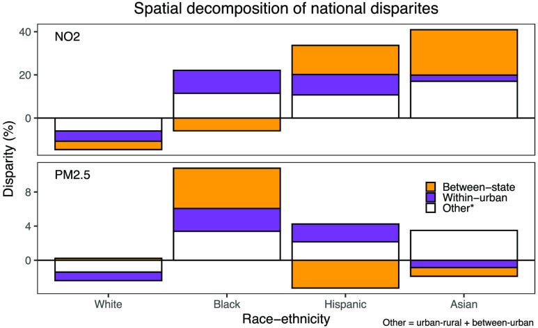
So within-urban disparities are big parts of the inequity in air pollution exposure Black and Hispanic Americans face, and are a real but lesser part of the story for Asian Americans, though their total NO₂ exposure is the largest of any group.
Within-urban disparities often reflect the legacies of redlining. Redlining maps from the 1930s remain strong predictors of pollution exposure today. The same dynamics that make inequity in within-urban air pollution exposure persistent can matter for data centers too, especially in cases where developers propose onsite gas generation near residential neighborhoods.
Why are old redlining maps such strong predictors of current exposure to air pollution? There are lots of compounding reasons:
Highways were deliberately built through them.
Redlining made it difficult for residents to build up equity, and without accumulated wealth, neighborhoods had less political power to resist new polluting industries, fund lawsuits, or extract concessions from developers.
Many cities used “expulsive zoning” to permit heavy industrial uses in Black residential neighborhoods.
It was easier to build new polluting industry in areas already polluted, because permitting reviews evaluate each new polluter’s marginal contribution to local pollution rather than the cumulative burden on the neighborhood.
Redlined areas have less tree canopy on average, and trees absorb some pollutants directly and cool the air down, which somewhat suppresses ozone formation.
While the Fair Housing Act and later reforms formally outlawed redlining and related housing discrimination, the highways and industries were still where they were built before it. One recent study found that historically redlined districts still have on average 56% higher NO₂ levels than the parts of the same cities that were designated the most desirable for federally backed mortgage.
A huge issue of any new large industries that have onsite pollution sources, like large data centers, is that they can reinforce the dynamic that keeps formerly redlined neighborhoods way more polluted than average. This is one of the clearest real potential dangers of the data center buildout. Data centers are on the market for things that could correlate with historically disinvested areas, like cheap land and an easy permitting environment.
A key question is how much we can rely on local government policy to keep communities safe from data centers pushing air pollution in very local communities over the line of harmful NO₂, and broader regions over the line of ozone and PM2.5. In places where government can’t be relied on to keep total air pollution below accepted thresholds, communities should say no to data centers with significant onsite primary power, and society more broadly should name and shame specific companies imposing excessive pollution on already overburdened communities.
Gaps in exposure persist despite the Clean Air Act’s general success, because the act mainly targets regional and national air quality, not so much very local sources of very local pollution. Exposure to local pollution often has more to do with what’s allowed to be built very close to you. So even as national and regional air quality improves, very local sources of primary PM2.5 and NO₂ can still harm the same neighborhoods they did 50 years ago.
The main hole to worry about in government air pollution control is very local air quality around big emitters, because that isn’t regulated as well. To fully consider the question of how and when we can and cannot rely on governments to make good decisions about air quality and data centers, I need to give a much more detailed overview of how data centers specifically contribute to air pollution, which will need to wait for Part 4. For now, your takeaway should be that data centers, as large industries that need to generate huge amounts of power, threaten to continue and reinforce these unjust patterns in who gets exposed to air pollution if they are built with huge amounts of onsite gas power close to residential areas.
What does the future look like?
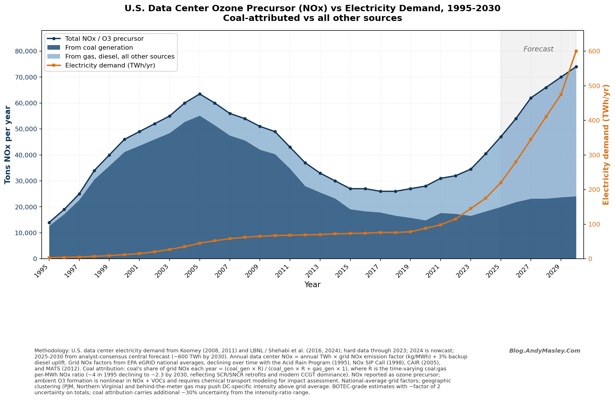
Before the year 2000, there was a lot of low hanging fruit for reducing air pollution, because everything we did emitted crazy amounts. To put this in perspective, if you naively assume that data centers cause the average levels of pollution from the grids they draw from per unit of energy, the grid in the 2000s was so dirty that the first big data center buildout at its peak was adding over twice as much PM2.5 to the air (both primary and especially secondary) as data centers will by 2030. Notice that even as coal declines, it’s still a huge part of total PM2.5 from energy.
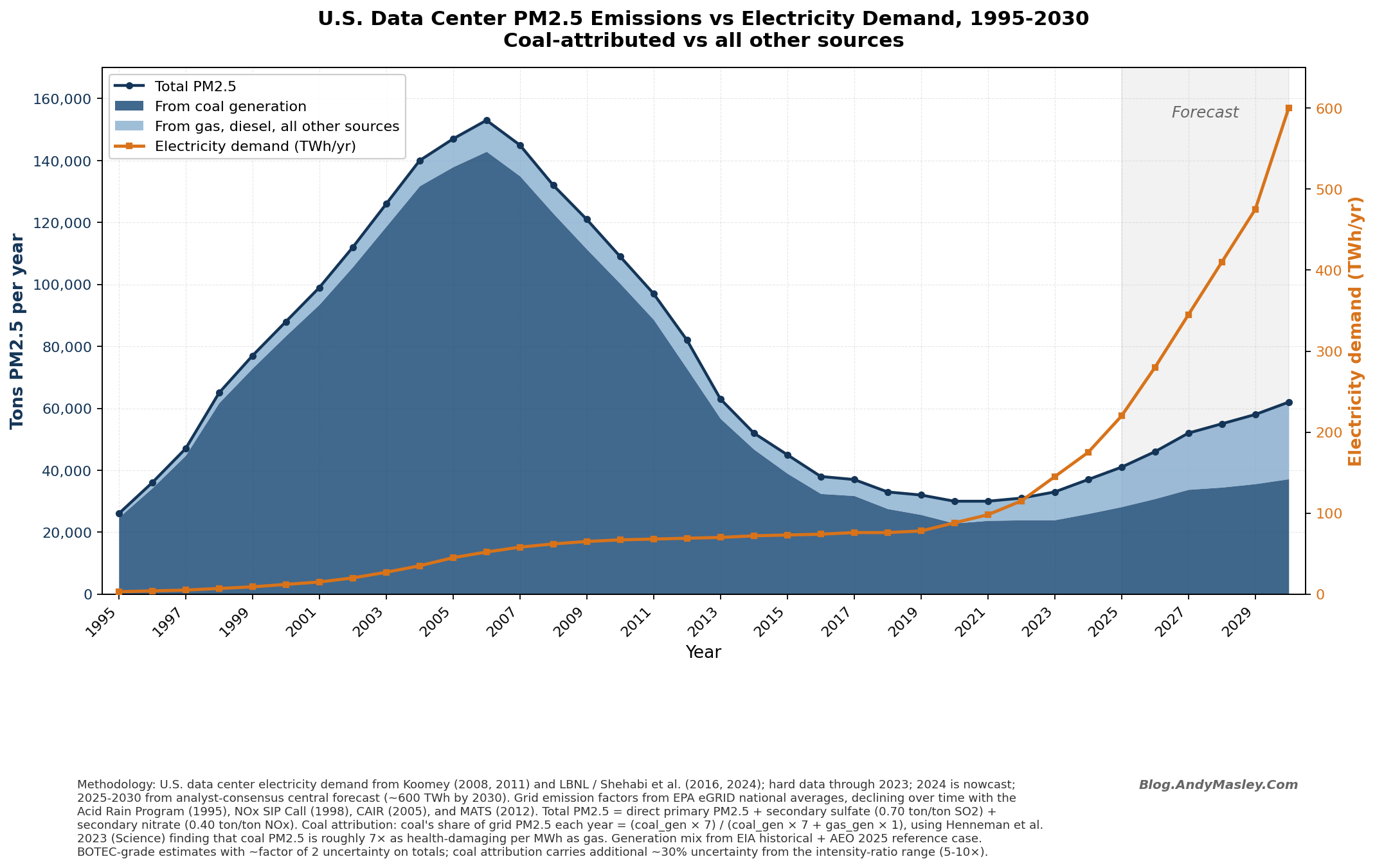
This is because the PM2.5 per unit energy of the American grid has been dropping off rapidly, partly because there are way more pollution controls on sulfur from coal plants (the CAIR Act in 2005 forced a retrofit of old coal plants with new pollution controls that you can see start to really take effect in 2007), and because coal plants were replaced with natural gas over time. Here’s a rough guess at the PM2.5 cost of a unit of energy:
The story of NOx and ozone is more mixed, because gas still emits a lot, so data centers in 2030 could be emitting more than ever.
Though NOx intensity has also declined a lot.
The grid being cleaner means that the remaining harms of air pollution will be trickier to reduce here.
The most promising future cuts for air pollution are usually going to overlap with what’s emitting the most, though not always. We can go line by line on the sectors emitting PM2.5 and NOx to think about what the future will look like. Note that these “anthropogenic” sources don’t include forest fires, which will be discussed more in the climate change section below.
PM2.5
Agriculture
Agriculture causes about 12% of total US anthropogenic PM2.5 mortality, and the large majority of that is from livestock. Maybe it’s time for you to join me in veganism ❤️🐖🐔🐟❤️.
There are a lot of relatively cheap ways to reduce this that could plausibly save thousands of lives a year together, maybe somewhere around 6,000, depending on the what’s actually done, which is about as much as all remaining deaths from electricity-sector PM2.5 emissions.42
Simple air pollution regulations could be imposed on farmers to make sure that they cut emissions using these tools, but as discussed before, farmers are politically untouchable in America and while these regulations have been considered by different agencies, politicians haven’t actually implemented them. I’m pretty pessimistic about this route to lowering PM2.5, even though it’d be pretty cheap and easy. Question farmers.
Industrial
Industrial sectors that emit a lot of PM2.5 include cement, iron and steel, chemicals, and petroleum refining. Iron and steel alone cause between 900 and 2,000 deaths per year, concentrated in places like Gary, East Chicago, the Houston Ship Channel, and the lower Mississippi industrial corridor.43
Transportation
Transportation is a huge air pollution success story, thanks to better catalytic converters and the slow death of diesel. Most of the remaining PM2.5 from transportation come from things that use diesel, like long-haul trucks, trains, and ships.
Cars are surprisingly not promising for reducing PM2.5 much more, because their tires and brakes now produce about as much as their exhaust.
Residential
98% of PM2.5 emissions from residential fuel combustion sources are from wood-burning, but wood-burning only provides 2.2% of residential energy in the US. Come on!!! This is responsible for something like 10-17% of all US PM2.5 mortality. What are we doing?!?!?!44
You might think this is okay, because people burning wood in a fireplace are the ones harmed by breathing it, and so this is an optional risk they’re taking on. But these numbers are only for outdoor air pollution. This is getting added to the air around the home burning the wood.
All pollution from US electricity generation in 2026 kills fewer people than this. Seems like we should stop using wood as heating in homes. The occasional campfire is fun, but relying on wood more consistently is just so bad for air quality.
Electricity
The remaining large sources of PM2.5 are still largely coal, but that’s expected to keep falling as gas, wind, and solar are now cheaper and more competitive. It seems like a lot of the low hanging fruit in making coal more clean has been picked.
Gas plants are much cleaner than coal for PM2.5 and SO2, but they do emit significant NOx which still forms secondary PM2.5, though much less than SO2. New gas plants with SCR controls are roughly one to two orders of magnitude less harmful per MWh than the coal units they’re replacing. Renewables emit basically nothing.
The main question for electricity is how we can retire coal plants faster, then how we can replace gas with clean energy. Data centers are delaying both, and causing a huge uptick in demand for gas. We’ll look into this more in Part 3.
NOx
Highway and off-highway vehicles
On-road NOx is a huge success story in reducing air pollution. Catalytic converters are much better, and EVs don’t emit NOx at all. The remaining transportation NOx is mostly from diesel, and mainly from long-haul trucks, buses, locomotives, ships, and off-road equipment like construction machinery and tractors.
Stationary fuel combustion
Gas-fired power plants are now the largest stationary NOx source in America, and this is being driven way up by the data center buildout.
New gas plants with “selective catalytic reduction” (SCR) cut 80-90% of NOx and emit small amounts per MWh. Old gas plants emit a lot more, sometimes an order of magnitude.
Industrial processes
Cement and steel again show up here. The very high temperatures form thermal NOx. Cement kilns can install some pollution controls, but retrofits of these are expensive. Refining and petrochemicals contribute meaningful NOx from heaters. A lot of this is technically controllable, and Texas, Louisiana, and California have all gotten major reductions out of refineries over the past 20 years, but the lower-hanging fruit has been picked and the remaining cuts are more expensive per ton.
Other
Synthetic nitrogen fertilizer used in agriculture gets partially converted to NOx by soil microbes, and could be significantly cut with available tech.45 This isn’t really regulated at all… wonder why…
Climate change
Climate change is going to make dealing with air pollution in America more difficult. Tiny cuts in PM2.5 can be easily swamped by massive new forest fires, among many many other problems. We’re at a low enough level of PM2.5 and ozone emissions that I’d personally bet the most effectual way to preserve national-level air quality will be focusing on cutting CO2 over cutting additional PM2.5 or NOx. We can do both with green energy, but projections for cutting emissions to zero anytime soon are bleak.
Takeaways
American air has, along most axes, gotten significantly cleaner in the last 20 years. While American air is way cleaner than it was decades ago and much cleaner than the global average, air pollution at any level is harmful, and so multiplied by our huge population still results in roughly 80-90 thousand deaths per year, almost all of them older and losing about 3-4 years each. Air pollution also causes short-term harm, among many other things it’s a big contributor to childhood asthma cases and ER visits.
If you were to chart where this harm is coming from, most of it comes from pretty normal American air. Most people in America live in relatively clean air, but the harms are not zero here and still accumulate over huge numbers of people. The big exception is California, which has a ton of compounding ways that air pollution is way worse where lots of people live.
Different types of air pollution have wildly different levels of harm. PM2.5 is the worst, followed by ozone as a distant second. NOx and SO2 are mainly harmful because they create PM2.5 and ozone when they react with specific particles in the atmosphere. NO₂ has important short-term harms, among other things it’s a major contributor to childhood asthma ER visits, and maybe long-term harms too.
Comparisons between different things that pollute are often wildly counter-intuitive. Cars especially emit very little NOx or PM2.5 now and are a bad reference point for major industries.
Maps of national pollution harm are often just population density maps.
The decline of coal and its replacement with gas has been a huge part of the general decline in American deaths from air pollution. Data centers threaten to delay or reverse the decline of coal, and are encouraging a huge separate buildout of new gas capacity that isn’t offsetting old coal plants. Data center companies are also the main private funders of new clean energy as well, but on net they will make American air more polluted in the short-term.
The effects of climate change on air pollution are large enough that, for many sources that have been cleaned to not emit much local air pollution, the CO2 they emit may “release” as much or more PM2.5 and ozone in expectation as the PM2.5 and ozone they emit directly.
Because everything that we do creates air pollution either directly or through electricity generation, we cannot just ban all air pollution, and instead need to set thresholds of general air quality to aim for and modify the behavior of industries around those. This is how American law approaches it. American air quality is governed very well at the national and regional level, but the local level governance has holes and is less reliable at preventing exposure to things like direct PM2.5 or NO₂.
Our intuitions about the harm of air pollution can be warped in a lot of ways:
We can underrate the harm of, by global standards, very clean American air. It’s still killing about 90 thousand people a year.
We can miss inequities by only looking at average levels of pollution.
We can be too optimistic about the future of air pollution reductions based on how the past has gone.
We can overrate the harms of tiny levels of pollution increase across very large populations or risks that we wouldn’t personally pay to remove.
We can overrate the harm of any new industry’s pollution if we don’t contextualize it with other industries or the general state of American air quality.
The fact that air pollution is harmful at any level makes two opposite sides mad at you: people will get mad at you when you say it’s okay for an industry to emit some air pollution, because that comes with real human harms, and others will get mad at you when you say we need to limit air pollution, because all air pollution’s harmful anyway and why are you getting in the way of industry? Both of these are wild oversimplifications that would lead to terrible policy.
When thinking about a new industry, the question should always be “Will this, along with all activity in the area, collectively reduce the general local, regional, and/or national air quality down to a level that we’ve separately agreed is too low?” If it does, we should rigorously regulate or just oppose it, and if not, we should allow it to emit reasonable levels of pollution like we do other industries. The key is drawing that arbitrary line at what level of air quality we think is too bad for all activity in an area to collectively degrade the air below. That line will always be wildly contentious, but we need to draw it and stick to it. Our national legal arbitrary line is the EPA National Ambient Air Quality Standards (NAAQS).
The dollar amount measuring air pollution health harms comes from applying a dollar value to human life and multiplying it by the odds that pollution kills people times the number of people exposed. This is important to understand but doesn’t translate well to other normal costs we consider in society.
The measured cost of air pollution is a useful tool but doesn’t tell us much in isolation. It’s important to know how the costs compare to other industries and whether a cost is being unjustly concentrated on already overburdened communities or spread equally across a wide area, very marginally increasing the average person’s risk.
People with less economic power are in general less able to resist industries pushing their communities over the line we set for clean air, so large disparities still exist in exposure to very local air pollution, and those are the places we need to be hawkish on it and cannot rely on good local governance alone.
We should expect fully electrified industries at this point to only produce huge amounts of new local air pollution at the extremes, because the electric sector is so much cleaner than it was 20 years ago (thanks almost exclusively to the decline of coal and its replacement with gas, plus pollution controls), but the extremes are in fact happening with the largest data centers.
The promising cuts to make left in air pollution are among other things the continued closure of coal plants, transitioning from gas to renewables, regulating agriculture, and maybe not burning wood anymore. These decreases are likely to be offset a lot by climate change increasing air pollution, so the main way emissions create additional PM2.5 and ozone going forward might be via their CO2.
A Loudoun supervisor’s white paper estimated they received $895M in 2025 data center tax revenue, and Prince William County estimated $280 million.
Both the WHO (2021) and the American Heart Association treat the concentration-response relationship as monotonic down to the lowest measured exposures.
The IHME Global Burden of Disease 2023 estimates gives US PM2.5 at 69,774 and ozone at 12,843, so about 82,600 total. These overlap a bit, because PM2.5 and ozone affect some of the same diseases, so adding them up slightly double-counts. GBD’s combined “ambient air pollution” parent node corrects for that and lands in the same ballpark.
Fine particles stick around in the air for about 4–7 days before rain washes them out or they settle, which is plenty of time for wind to push them hundreds or thousands of miles. From this paper: “The all-models-average residence time is shortest for SS with about half a day, followed by SO4 and DU with four days, and POM and BC with six and seven days, respectively.”
GBD 2023 says about 13,000 US deaths a year are caused by ozone, with deaths almost entirely coming from COPD.
The American Lung Association says smoking causes “approximately 80 percent” of COPD deaths. The CDC gives the number as “as many as 8 out of 10.” For ozone, total US COPD deaths come to around 150,000, so 13,000 ozone deaths works out to about 10%.
EPA’s 2024 benefits document and BenMAP outputs usually put 85-95% of the dollar value from PM2.5/ozone cuts in avoided premature deaths. The rest is hospital visits, ER visits, asthma symptoms, and missed work or school.
One large cohort study followed 53 million US Medicare beneficiaries and found that a 10 ug/m3 increase in yearly average PM2.5 was associated with a 5% increase in all-cause mortality. Other major studies find it’s somewhere in the 5-8% range. This one finds 7.3%, this is 4-6%.
This is the largest multi-city short-term PM2.5 study and found about 0.68% additional all-cause mortality per 10 ug/m3 short-term PM2.5 increase. Per unit, these short-term effects are an order of magnitude smaller than the long-term coefficients described in footnote 7, partly because very quick spikes mostly bring forward deaths in already vulnerable people, whereas long-term exposure builds up new disease risk.
In the eastern U.S., every part-per-billion of NOx can produce about 1 to 7 parts-per-billion of ozone. The amount of PM2.5 nitrate creates is much smaller and depends a lot on ammonia availability. By mass, that implies much more ozone than nitrate PM2.5.
Daytime NOx lifetime is typically hours to about a day, mostly limited by OH oxidation of NO2 to HNO3 and other reservoir species, with longer effective lifetimes in winter and at higher latitudes. Wind at 5 to 15 mph carries it tens to a few hundred miles before it converts, which the EPA assumes happens in its interstate transport rules. The secondary PM2.5 it eventually forms with nitrate lingers in the air for longer as discussed in footnote 4, so PM2.5 impacts from NOx can show up much farther downwind than ozone impacts from the same source.
Coal is the only major US power source that contains significant sulfur. Natural gas has sulfur compounds removed before delivery, and oil is now a small part of US electricity. EPA Power Sector Data, EPA eGRID, and EIA electricity emissions data show coal causing the large majority of SO2 from the electricity sector recently.
US SO2 emissions are down about 95% from their peak in the late 70s and early 80s. The biggest wins in reducing SO2 were the Clean Air Act Acid Rain Program, the spread of air pollution control devices in coal plants (scrubbers), and coal-plant retirements. You can see the long run decline EPA’s Air Quality National Summary.
For how much the decline mattered for public health, see this study, which found that coal PM2.5 deaths among people receiving Medicare fell from around 43,000 a year between 1999 and 2007 to about 1,600 a year by 2020, roughly a 95% drop. The study attributes fewer deaths than some other models, here and here.
This study uses ambient NO₂ as a proxy for traffic pollution and finds that it caused about 134,000 new childhood asthma cases per year in the US, roughly 17.6% of all new childhood asthma. This study estimated that in the US, ozone is responsible for 8 to 21% of asthma ER visits and PM2.5 for 3 to 11%.
Each pathway has its own literature.
Heart attacks: this study found PM2.5 elevations within hours preceding MI onset in the Greater Boston area, large enough to detect in case-crossover designs.
Stroke: this study found a 34% increase in ischemic stroke odds within 24 hours of PM2.5 elevation, including at AQI levels EPA calls “moderate.”
Cognition: this study found faster long-term cognitive decline in older women with higher PM2.5 exposure; short-term studies find similar acute decrements in attention and working memory.
Daily mortality bumps: this study found about 0.68% additional daily all-cause mortality per 10 ug/m3 across 652 cities.
This meta-analysis of how pollutants drop off as you move away from roads found that NO₂ falls off within a few hundred meters, because the molecule either reacts with other things in the air (like ozone and OH) or just disperses.
US ambient NO₂ has dropped more than 50% at most monitoring sites since 2000. Both the annual mean limit (NAAQS: 53 ppb) and the standard for the 98th-percentile 1-hour daily maximum (100 ppb) are now well below the legal limits at almost all US sites. Getting this all from EPA Air Trends, Nitrogen Dioxide.
Standing right next to a wood fire can put you in a high-PM2.5 breathing zone. I use about 200 ug/m3 as a round, high-exposure value, which seems consistent with literature reviews on this. DC’s annual average PM2.5 is about 7.6 ug/m3 in AQLI and EPA AirData, so over a full year you breathe about 7.6 x 8,760 = 66,600 ug/m3-hours. One hour next to the fire adds about 200 - 7.6 = 192 extra ug/m3-hours, or 0.3% of the yearly total.
This study estimated total US PM2.5 exposure from human sources to be about 6.5 µg/m³ in 2014, and the national average to be 8 µg/m³, so natural sources made up about 15 to 20%. This study found that since 2016, wildfire smoke has wiped out about 25% of the multi-decade progress in cutting PM2.5, and more than 50% in many western states. So the natural share is rising.
In EPA’s 2020 National Emissions Inventory, wildland fires (both wildfires and prescribed burns) have overtaken every other category as the biggest source of primary PM2.5 emissions in the US, ahead of residential wood burning, road dust, and industrial sources. Three other studies back this up, here here and here.
US “background” ozone, meaning ozone not from domestic human NOx/VOC emissions, is roughly 25-50 ppb, versus typical summer surface ozone of 50-70 ppb. That puts background around 40-70% in many regions, especially the West and higher elevations. Purely natural ozone is lower, more like 30-50%, because it excludes global human emissions and uses preindustrial methane. Discussed here and here.
GBD 2023 estimates have ambient PM2.5 at about 7-8% of global deaths and 5% of DALYs. In the US, it is about 1.7-2% of deaths and 1.5-2% of DALYs.
This is why I use 3-4 years for PM2.5. In their Medicare analysis, the average elderly person whose death is attributed to PM2.5 had about 3.6 years of remaining life expectancy. GBD methods give more like 10-14 years, but they do not adjust for the fact that pollution deaths often exacerbate previous medical conditions in people who were more close to dying, so I use 3-4 years to adjust.
Using AQLI, DC’s PM2.5 is about 7.6 ug/m3 and the rural US average is about 6.7, a gap of 0.9. AQLI’s 0.098 years lost per ug/m^3 gives 0.09 years, or 33 days, so “about a month.” That coefficient comes out of cohort work like Pope et al. 2002, Di et al. 2017, and Wang et al. 2020. Using the method here gives more like 6 days.
1970 pickup trucks were certified at about 3.4 grams per mile of non-methane hydrocarbons under the federal standards at the time, when there were no catalytic converters and engines were carbureted. Modern Tier 3 Bin 50 light trucks have to keep NOx and NMOG combined under 0.05 g/mi, with a target of 0.030 g/mi NMOG+NOx by 2025. That’s about a 98-99% reduction in tailpipe non-CO2 pollution. Sources: EPA Tier 3 standards, EPA Green Vehicle Guide, and EPA’s history of transportation emissions reductions.
Leaf-blower PM depends on whether you count only exhaust or also dust. For the truck, EPA MOVES and CARB put 300 miles from a modern light truck at only a few grams of PM2.5. For the blower, CARB and this study support a high combined exhaust-plus-dust value around 15 g/hour. Compared with about 4 g from the truck, that is about 4x. This article is useful color, but not the PM2.5 source.
10,000 cars x 5,000 miles x about 0.010 g/mi total PM2.5 is about 500 kg. The car PM number comes from EPA MOVES plus this study for non-exhaust PM. Roughly, that equals about one hour of NYC commercial cooking, 2-3 days from a mid-sized cement plant, one day from a cruise ship at berth, or 10 wood-heated homes for a winter. Those comparisons use linked NYC, EPA, ICCT/EPA, and wood-smoke sources.
The 2024 Corolla LE gets 38 mpg combined. Using EPA’s 8,887 g CO2 per gallon of gasoline, that’s 234 g CO2/mile, or 2.8 tons/year at average US mileage. It is Tier 3 Bin 50 certified, so NOx and NMOG is around 0.05 g/mi. For PM2.5, a lot’s created by brake and tire wear, which OECD puts at 30-60 mg/mile. EASIUR puts the local US health damage at maybe $10-$25/year. The CO2 side is about $42/year from this study’s estimate that every ton of CO2 mitigated gets $15.1 in wildfire health savings, or $60-$85 if you include ozone, dust, and stagnation. So CO2 does about 2-8x more US air damage than the car’s direct emissions, and >10x globally.
A modern gas plant emits about 360 kg CO2/MWh. Pollution is roughly 36 g NOx and 12 g PM2.5 per MWh (with good NOx controls and EPA’s PM2.5 factor). This model estimates local health damage around $1-$2/MWh. This study finds the US-only wildfire health cost of the CO2 from gas at about $5.40/MWh, or more with other climate-air effects and global impacts. So CO2 does about 3-10x more US air damage than stack pollution.
This study says CO2-driven wildfire smoke damages are much bigger globally than in the US, they’re about $15/ton here versus around $100/ton globally. Obviously this makes sense, the world’s big!
US coal power fell from about 966 TWh in 2019 to about 635-653 TWh in 2024, a 32-33% drop. The numbers come from this EIA table and this EIA table.
EPA’s central value of a life is $7.4 million in 2006 dollars. About $12 million in 2026 dollars.
EPA’s 2024 benefits document and BenMAP outputs usually put 85-95% of the dollar value from PM2.5/ozone cuts in avoided premature deaths. The rest is hospital visits, ER visits, asthma symptoms, and missed work or school.
In 2003, EPA tried a lower VSL for people over 70 in its Clear Skies analysis. Critics called it the “senior death discount,” and EPA dropped it. This article covers this.
Open fireplaces emit roughly 10-17 g of primary PM per kg of wood, mostly PM2.5, using EPA AP-42 Chapter 1.9 and its fireplace emission-factor background. Note that this is measuring outdoor air pollution, not what people in the homes breathe. A 5 kg evening is about 50-85 g; Shlipak et al. 2026 in Science Advances gets about $99B in damages over 485,000 tons of residential-wood PM2.5, or roughly $200K/ton, so that evening is about $10-$17. Almost all of that is health damage, not climate damage, because biogenic CO2 is roughly carbon-neutral over regrowth time. NOAA repository copy.
This HHS document puts VSLY at $604K with a 3% discount rate and $1.006M with 7%, in 2024 dollars for 2025 impacts. The method comes from HHS guidance. I use $550K as a conservative round number: below the 3% figure and about 10% lower than the downstream estimates would otherwise be.
4,000-9,000 annual US deaths from fossil power-plant PM2.5 comes from this modeling and this study, most of it is coming from coal. Using IHME GBD 2023’s 21.2 DALYs per air-pollution death, that is about 85,000-190,000 DALYs, or $47B-$105B/year at the $550K/DALY from FN35. Deryugina et al. 2019 would instead give about 14,000-32,000 life-years and $8B-$18B/year, but I use GBD here so the dollar comparisons stay apples-to-apples with COBRA.
About 1.2 million New England homes burn wood at all, from EIA’s RECS tables and this EIA summary. Scaling EPA NEI emissions and this study gives about 270-360 deaths/year, or $3B-$4B, if you count all wood-burning homes. Counting only primary wood-heating homes gives about 130 deaths and $1.5B. Big uncertainty: supplemental burning, local dose-response, and cross-state smoke. The adjustment mentioned in FN36 would shrink it about 5-6x.
In Ohio v. EPA, the Supreme Court put the 2023 Good Neighbor Plan on hold on June 27, 2024 while litigation continued. EPA later moved into reconsideration and announced a proposed action on January 28, 2026. EPA’s live Good Neighbor and interstate-transport pages are the current status. As of May 2026, the plan is not being enforced in its original strong form.
This study tracked Medicare data and found a 7.3% higher all-cause mortality risk per 10 ug/m3 more long-term PM2.5, or about 0.73% per 1 ug/m3. This study and this study find Black-white PM2.5 exposure gaps around 1.4-2.0 ug/m3, which works out to about 1-1.5% extra all-cause mortality risk from PM2.5 alone.
This study found PM2.5 exposure lowered overall from 2010 to 2019, but relative racial gaps widened. In 2019, the least-white census tracts had 16% higher PM2.5 than the most-white tracts, and ethnic relative disparities in PM2.5-attributable mortality grew by 40%. This copy has the repository version.
This study estimates about 17,900 US deaths/year from agriculture-related PM2.5, including about 15,900 from food production. Animal-based foods cause about 80% of the food-production damage, or about 12,700 deaths. The study says on-farm fixes could cut food-production mortality by about half, so rounding that to 6,000.
The range comes from two estimates, this that gets around 900, and this that’s closer to 2000.
Residential wood burning is about 10-17% of US anthropogenic PM2.5 mortality across this, this, and this study. The spread is mostly caused by differences in thinking on secondary PM2.5, indoor vs outdoor exposure, and wildfire vs anthropogenic wood. This residential wood-heating overview says wood provides 2.2% of residential energy but 98% of residential-combustion PM2.5, implying roughly 1,000x more PM2.5 per unit of residential energy.
Fertilizer-fed soil microbes turn ammonium and nitrate into NO and N2O. The NO escapes and becomes NO₂, as EPA’s CMAQ docs on soil microbial NOx emissions explain. This study estimated soil microbes were 20-32% of Central Valley NOx during the growing season. For ways of controlling these better see this agricultural nitrogen management options review plus this article.
I appreciate all the work you’ve put into this, a great public service. It’s very interesting how transportation pollution has been reduced so much, and how switching to EVs may not help much with PM2.5 emissions since half are from the tires and heavier cars will Emi more, and because electricity is still heavily reliant on gas and somewhat on coal. I wonder how much catalytic converters would help reduce NOx from gas turbines producing electricity.
I know you didn’t go into climate much here, but saying CO2 emissions from US electricity generation causes much PM2.5 because of wildfires seems like a stretch. Most wildfires in North America are from bad electric line maintenance, poor forestry management, arson and high seasonal winds. Most CO2 that affects climate is already in the atmosphere and most additional amounts come from Asia. The IPCC attributes only small increases in fire weather durations to emissions. Spending more money on better transmission line and forestry management may be more effective than carbon reductions.
Two questions:
Is there some way you can help me understand how SO2 and NOx lead to PM2.5? I think of PM2.5 as bits of solid in the air (like metal or plastic or dust) and I don’t understand how soluble gases can turn into those. But maybe there’s some explanation that helps me understand. This seems like an important and central point, since the PM2.5 impacts of NOx are such a large part of the effects.
You also say: “When thinking about a new industry, the question should always be “Will this, along with all activity in the area, collectively reduce the general local, regional, and/or national air quality down to a level that we’ve separately agreed is too low?”” I saw in the text that this is how the EPA regulates things, but why wouldn’t it be better to do cost-benefit analysis, or impose monetary penalties in proportion to costs, rather than do the threshold analysis you mention? As you said, most of the impacts occur below the threshold, because most places are below the threshold.